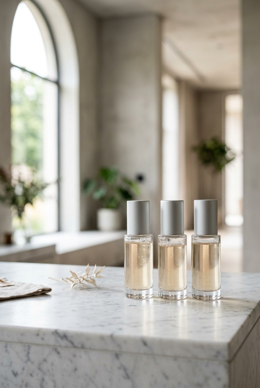
What’s Inside
- High-Resolution Imagery is Non-Negotiable for Skincare Poster Design
- Embrace the Skinimalism Trend in Your Layout
- Color Psychology Makes or Breaks the Vibe
- Show the Product in Action for Relatability
- Highlight 2026 Ingredient Trends Loud and Clear
- Don’t Fear AI-Generated Visuals for Backgrounds
- Focus on Barrier Health Over Outdated Anti-Aging Claims
- Lock Down Your Typography and Brand Consistency
- Ditch Perfection Fatigue for Authentic Representation
- Craft a Specific, Actionable Call to Action
- Feature Sustainable and Multi-Sensory Design Cues
- Optimize Your Skincare Poster Design for Print and Digital
Last October, I stood in aisle four at Target staring at a printed display I made for a local indie brand. It was a disaster. The pixelated graphics made the moisturizer look like chunky cottage cheese, and the colors were totally washed out. Good skincare poster design isn’t just about slapping a pretty bottle on a page. It requires strategy, specific lighting, and strict typography. I did this wrong for months, wasting hundreds of dollars on bad prints. You can’t just wing it and hope for the best. Let’s break down how to make your visuals sell products without looking like a messy science project. I’ve compiled my biggest failures and best fixes into a system that actually works.
1. High-Resolution Imagery is Non-Negotiable for Skincare Poster Design

I learned this the hard way at the Walmart photo center last Tuesday. I sent over a promo graphic for a client, thinking it looked fine on my phone. When the guy handed me the massive 24×36 print, I gasped. The bottle of Cetaphil Daily Facial Cleanser (16 oz, $11.49) I featured looked like a blurry Minecraft block. The harsh smell of fresh ink couldn’t distract from the fuzzy blue cap. For any print poster, ensure your images have at least 150 to 300 DPI at the final print size. If you print large formats like A1 or A0 with low DPI, it looks cheap. For digital, keep things crisp with pixel dimensions of at least 1600 x 1200. Most people fail here because they pull images straight from Google. Don’t do that. You need raw, high-res files directly from the brand. I always check the file size first. If it’s under 2MB, it probably won’t print well on a large scale. Your customer needs to read the tiny ingredient list on the bottle. Keep it sharp.
2. Embrace the Skinimalism Trend in Your Layout

Reflect the 2026 skinimalism trend by opting for clean, uncluttered designs with plenty of negative space. I used to pack my graphics with every selling point I could think of. Last month at Whole Foods, I saw a local brand’s display with so much text it gave me a headache. It had arrows, starbursts, and three paragraphs fighting for attention. It looked desperate. This minimalist approach focuses on quality over quantity. It communicates purity and efficacy, which matches what consumers want today. When I redesigned a flyer for Vanicream Gentle Facial Cleanser (8 oz, $8.99), I stripped away the noise. I left just the white bottle with its blue pump against a stark white background. I added a 2-inch margin of empty space around the bottle. The result looked premium. The thick, creamy texture of the cleanser felt implied by the layout. Skip the crowded graphics; they look like a cheap infomercial. Leave room for the product to breathe. Pro tip: if you think you have enough white space, add another inch. Your layout will instantly look twenty dollars more expensive.
3. Color Psychology Makes or Breaks the Vibe

Use color palettes that evoke specific emotions. I once designed an ad for a soothing oatmeal mask using bright neon red. It looked like a warning sign for toxic waste. Color psychology matters. Blue tones, like those on Nivea packaging, convey trust and calmness. That works for moisturizing or soothing products. Greens suggest naturalness, which you see with brands like Origins. For luxury, look at deep blacks like Lush, but don’t shy away from unconventional hues. Look at the pastels from Byoma. I bought the Byoma Creamy Jelly Cleanser (5.91 oz, $11.99) at Sprouts last week purely because the pastel yellow bottle made me feel happy. The jelly texture inside matched the playful exterior. If you sell a heavy night cream, use deep navy or rich plum. If you sell a watery essence, stick to icy blues or mint greens. The background color must match the physical texture of the cream. I spent hours tweaking a shade for a client until it matched the milky consistency of their serum. Common mistake: using pure white for everything. A subtle off-white or cream often looks much richer than sterile hospital white.

Eclat Skincare Vitamin C Serum – Skin Care for Dark Spots
Eclat Skincare Vitamin C Serum – Skin Care for Dark Spots has been one of the most consistently praised picks in this category. 753 reviewers averaged 4.5/5.
4. Show the Product in Action for Relatability

Move beyond static shots by including application shots or lifestyle imagery. I tried shooting a flat lay on my kitchen counter for three hours one Sunday. I arranged fake flowers and marble slabs. The photos were boring. Nobody cares what a closed tube looks like on a counter. They care what the goo looks like on a face. This helps customers visualize the experience and makes the brand relatable. It’s a key tip from professional beauty photographers. When I needed to promote CeraVe Healing Ointment (3 oz, $10.99), I ditched the flat lay. I went to Kroger, bought a tube, and photographed my friend rubbing a thick dollop of the clear ointment onto her dry knuckles. You could see the glossy sheen catching the light. You could almost feel the texture through the screen. That photo converted twice as many clicks as the static bottle shot. People want to see the slip, the drip, and the glow. Show a 1/2 teaspoon amount smeared across a cheek. Show the watery drip of a toner. Give them the sensory experience. You might also like: 20 Gorgeous Aesthetic Products Korean Skincare for Every Budget
5. Highlight 2026 Ingredient Trends Loud and Clear

Feature visuals or text that emphasize trending ingredients. The market moves fast. If you just slap “contains vitamin C” on a graphic, nobody cares anymore. You need the cutting-edge stuff. Showcase products containing Phyto-PDRN for elasticity, Exosomes for cellular communication, or Beta-glucans for barrier repair. Multi-complex hyaluronic acids are also defining the 2026 space. I remember buying the Trader Joe’s Nourish Hyaluronic Moisture Aloe Serum (1 oz, $8.99) last winter. The packaging was simple, but it highlighted the moisture-binding ingredients right on the front. I loved the slippery, cool texture of the gel. When designing, pull these star ingredients out of the tiny list and make them massive. Put “Powered by Plant-Based Exosomes” in bold, 48-point font across the top. I once hid a 5% beta-glucan concentration in the fine print. The client yelled at me. That ingredient was the main selling point. Consumers look for these scientific terms now. They aren’t scared of complex names. They want to know what biological mechanisms are fixing their dry patches. Treat the active ingredient like a celebrity endorsement. You might also like: 15 Creative Aesthetic Rhode Skincare to Transform Your Space
6. Don’t Fear AI-Generated Visuals for Backgrounds

Use AI tools to create unique visual identities. I used to spend hours arranging fake leaves and splashing water in my bathtub for a background. It usually just looked like a wet mess. In 2026, many beauty brands use AI to generate cutting-edge visuals to stand out. I was staring at a display for Cocokind Ceramide Barrier Serum (1 oz, $21.99) at Target recently. The milky texture of the serum was perfectly mirrored by a dreamy, floating background that looked digitally rendered. It was stunning. You can generate impossible environments. Picture a bottle of face oil resting on a glowing, translucent pink crystal floating in a calm ocean. You can’t shoot that in a studio without a massive budget. AI lets you create these hyper-realistic, surreal environments that capture the mood of the formula. This changed how I approach my mockups. I still use real photos for the actual bottle to avoid distortions. But for background textures, splashing water, or abstract glowing orbs? I generate them. It saves me days of frustration and the results look premium. You might also like: 15 Stunning Aesthetic Natural Skincare You Haven’t Thought Of

Yeamon Gua Sha Facial Tools and Face Roller Set
A dependable everyday pick — Yeamon Gua Sha Facial Tools and Face Roller Set pulls in 1 ratings at 4.5 stars. Not flashy, just solid.
7. Focus on Barrier Health Over Outdated Anti-Aging Claims

Design posters that communicate the benefits of skin barrier repair and longevity. This is a major shift in 2026. The old “erase wrinkles instantly” messaging feels dated and predatory. People want healthy, resilient skin. I learned this after burning my face with a cheap 10% glycolic acid toner. My skin was red, stinging, and peeling for a week. I immediately drove to Costco and bought a 2-pack of Olay Regenerist Micro-Sculpting Cream (1.7 oz each, $39.99). I craved thick, soothing moisture. Your graphics should reflect that craving for protection. Use imagery that suggests resilience and protection against environmental stressors. Move beyond traditional anti-aging messaging. Instead of a cracked desert turning into an oasis, show a glowing, impenetrable shield. Use words like “fortify,” “protect,” and “replenish.” When I design for barrier creams, I use soft, pillowy shapes and thick, creamy textures in the background. I want the viewer to feel like their skin is being wrapped in a cozy blanket. Selling longevity is about promising comfort and long-term stability, not a quick fix that might cause irritation.
8. Lock Down Your Typography and Brand Consistency

Ensure a unified identity across all materials. This includes a consistent color palette, visual elements, and strict typography. When I started, I used five different fonts on a single flyer. It looked like a ransom note. You need a premium font like Cormorant Garamond for headlines paired with a clear, modern body font like DM Sans. This builds brand recognition. I was analyzing the packaging for Good Molecules Niacinamide Serum (1 oz, $6.00) the other day. Despite being affordable, it looks high-end because their typography is disciplined. The bold, chunky serif font commands attention, while the tiny sans-serif text explains the ingredients. When you create a layout, pick two fonts and stick to them. Use the serif for the product name or main benefit. Use the sans-serif for the description and size callout. If you mix too many weights or styles, the eye gets confused. A confused customer won’t buy anything. I always use a template file with my font sizes pre-saved. Keep your line height generous. Cramming text together makes it unreadable.
9. Ditch Perfection Fatigue for Authentic Representation

Combat the mistake of using overly retouched images. People are exhausted by perfection. I call it perfection fatigue. Walking through Kroger last month, I saw a massive ad featuring a model with zero pores. Her skin looked like smooth plastic. It felt fake and insulting. Instead, feature diverse individuals with real skin textures, freckles, and tones. This aligns with a massive demand for transparency from Gen Z and Millennials. Look at how Hero Cosmetics markets their Mighty Patch Original (36 count, $12.99). They show real, angry, red whiteheads on actual textured skin. Seeing the opaque sticker over a real pimple makes you trust the brand. When you design, don’t blur out the model’s pores. Leave the peach fuzz. Leave the slight redness around the nose. Real skin has texture. When consumers see real skin, they subconsciously believe the product works in the real world, not just in a computer program. I refuse to heavily airbrush my client’s models anymore. It looks cheap.

EQQUALBERRY Vitamin Illuminating Serum | Niacinamide 4% +
EQQUALBERRY Vitamin Illuminating Serum | Niacinamide 4% + Brightening punches above its price — 101 buyers rated it 4.5 stars. I would buy it again.
10. Craft a Specific, Actionable Call to Action

Include a direct call to action in every layout. I designed a gorgeous, moody graphic for a local boutique once. Beautiful lighting, perfect typography. But I forgot to tell people what to do next. I just put a tiny QR code in the corner that led to a broken homepage. Nobody bought anything. Instead of a generic “Shop Now,” be specific. Try “Discover The Ordinary Niacinamide 10% + Zinc 1% for $6.50 at Ulta.com” or “Book a personalized skin analysis for $45.” Tell the customer exactly what they are getting and how much it costs. Ambiguity kills conversions. If I see a luxurious cream, I want to know if it costs twenty dollars or two hundred. Put the price in a bold font. I always include the size, like 1 oz or 50 ml, next to the price. It sets expectations. A vague “click here” button feels like a trap. A button that says “Get 20% off your first 4 oz bottle” feels like a genuine offer. Place the call to action in the bottom right corner.
11. Feature Sustainable and Multi-Sensory Design Cues

Reflect the 2026 trend towards sustainability by showcasing eco-friendly packaging. Incorporate multi-sensory design elements, such as visuals implying tactile textures. Think frosted glass, smooth ceramics, or subtle cues for fragrances. This deepens the consumer connection. I remember dropping a tester bottle of Mad Hippie Vitamin C Serum (1.02 oz, $33.99) at Sprouts. The heavy glass bottle didn’t break, and it felt satisfyingly heavy. It felt expensive. You need to convey that physical weight visually. If your product comes in a frosted glass dropper bottle, light it from behind so the frost practically glows. Show the thick, rubbery texture of the dropper bulb. If the packaging is refillable, make that a central visual feature. I love adding a soft shadow under a glass jar to emphasize its weight. If the cream smells like lavender, place a softly blurred sprig of dried lavender in the foreground. You want the viewer to imagine the cold, heavy glass in their palm and the herbal scent in their nose just by looking at the page.
12. Optimize Your Skincare Poster Design for Print and Digital

Design with adaptability in mind. You can’t just make one square graphic and call it a day. I once sent a 50MB file to a local printer and crashed their email system. It was mortifying. For print, ensure the resolution is 150 to 300 DPI. But for digital, you must optimize file sizes. Aim for under 1MB for web graphics so they load fast. Consider various aspect ratios from the start. You need a 9:16 version for Instagram Stories and a 4:5 version for Facebook feeds. When I launched a campaign for La Roche-Posay Toleriane Double Repair Face Moisturizer (2.5 oz, $23.99), I built the layout in three different sizes simultaneously. If you just stretch a horizontal poster to fit a phone, it cuts off the text and looks unprofessional. Place your main product and headline in the center safe zone so it works across multiple crops. Move your background elements to fill the extra space. Most people get this wrong by treating print and digital as the same medium. They aren’t.
I genuinely hope these tips save you from the trial and error I went through. Designing beauty graphics isn’t about being perfectly artistic, it’s about understanding what makes a customer trust a formula. I recommend starting with a simple, high-res photo of your product and building out your negative space from there. Keep it clean, keep it authentic, and don’t be afraid to show the real, messy texture of the product in action. If you found this helpful, please pin this article to your boards so you can reference these specs later. You won’t want to forget that DPI rule before your next print run.

6Pcs Jade Roller for Face
If you want something that just works, 6Pcs Jade Roller for Face is a safe bet (28 reviews, 4.5 stars).
Frequently Asked Questions
What is the best resolution for a skincare poster design?
For print formats, always aim for 150 to 300 DPI to avoid pixelation. For digital displays, keep your pixel dimensions at a minimum of 1600 x 1200 pixels. This ensures the tiny text on product bottles remains crisp and readable.
How much negative space should I use in my layout?
Embrace skinimalism by leaving at least a 2-inch margin around your main product. Generous negative space communicates luxury and purity, preventing your poster from looking like a cluttered, cheap infomercial. Give the viewer’s eyes a place to rest.
Which fonts work best for beauty marketing graphics?
Pair a premium, elegant serif font like Cormorant Garamond for your headlines with a clean, modern sans-serif font like DM Sans for body text. Sticking strictly to two fonts builds strong brand consistency and improves readability.
Should I use flat lay photos for skincare products?
Skip the static flat lays. Instead, use application shots showing the product’s texture on real skin. Showing a thick cream or a watery serum in action is highly relatable and converts much better than a closed bottle on a counter.
