What’s Inside
- Embrace Experiential Zones Over Boring Shelves
- Implement AI-Powered Personalization Stations
- Optimize Lighting for True-to-Life Product Appearance
- Engage Multiple Senses with Thoughtful Marketing
- Design for Blue Beauty and Sustainability Transparency
- Create Clear Visual Hierarchy and Uncluttered Displays
- Integrate Digital Storytelling and Interactive Elements
- Prioritize Skinimalism and Ingredient-Focused Merchandising
- Offer Life-Stage Focused Product Curation
- Design an Engaging and Visible Checkout Area
- Use Pop-Ups for Immersive Brand Storytelling
- Create Sensorial Synergy with Unique Product Packaging
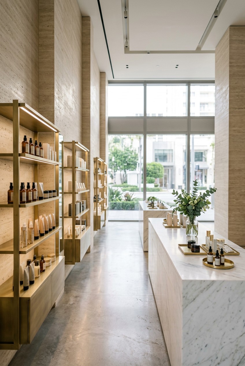
Last Tuesday at Whole Foods, I shattered a heavy glass bottle of organic rosehip oil right in the middle of aisle four. The shelf was crammed with tiny boxes, and when I reached for a moisturizer, the whole row collapsed. It smelled like a botanical garden mixed with pure embarrassment. That exact moment is why brilliant skincare store design matters so much. If the shelves are a chaotic mess, I won’t buy anything. I’m a skincare researcher, and I spend half my life analyzing how products are displayed. Good retail spaces make you want to linger and play. Bad ones make you want to run for the exit. I’ve noticed that the way a shop organizes its serums and creams completely changes how I shop. Let’s break down the twelve concepts that actually work.
1. Embrace Experiential Zones Over Boring Shelves

I’m completely obsessed with the idea of a “Skincare Smoothie Bar.” I saw this concept at Ulta recently, and it mimics Drunk Elephant’s travel retail counters perfectly. Instead of just staring at cardboard boxes, you get to actually mix products together. I tried blending 1/4 teaspoon of Drunk Elephant Protini Polypeptide Cream ($68.00 for 1.69 oz) with exactly two drops of their D-Bronzi serum. The texture was incredibly silky, and I could feel exactly how it would sit on my face. It smelled faintly of cocoa and peptides. Most stores get this wrong by putting out tiny, crusty tester tubes that nobody wants to touch. A dedicated mixing zone encourages you to play. You’re not just buying a jar. You’re figuring out a custom routine. I’ve spent a full forty-five minutes at one of these stations just testing different consistencies. It’s brilliant because it keeps people in the store longer. If you just build flat shelves, I’m grabbing my usual cleanser and leaving. But if you give me a little spatula and a clean palette, I’m going to test everything. The little spatulas make it feel so hygienic. Plus, seeing the colors swirl together is oddly therapeutic. It changes the whole vibe from a clinical pharmacy to a fun playground. If your displays aren’t interactive, you’re missing out.
2. Implement AI-Powered Personalization Stations

I used to guess my skin type constantly. I thought I was incredibly oily for years, so I kept buying harsh, stripping toners. It wasn’t until I used an AI skin analysis tablet at a Target beauty aisle that I realized I was actually severely dehydrated. These AI stations, powered by tech from Haut.AI or Perfect Corp, are popping up everywhere, and they’re wildly accurate. You just snap a quick selfie in front of the smart mirror. Within thirty seconds, the screen glows bright white and breaks down your pore size, wrinkle depth, and hydration levels. It’s fascinating. I literally gasped when I saw my sun damage on the screen. It was a huge wake-up call. Research shows that 24 percent of consumers literally don’t know their own skin type. I was definitely in that statistic. I’d buy heavy mattifying lotions and wonder why my face felt tight and itchy. Having a tablet right next to the product displays completely removes the guesswork. It told me to buy a hydrating gel instead of a clay mask. I ended up purchasing the Neutrogena Hydro Boost Water Gel ($19.99 for 1.7 oz) right then and there. If you design a retail space, you need these tablets. They boost sales because people finally feel confident in what they’re buying. Just make sure the screen is wiped down regularly. I hate tapping a greasy iPad. Learned that the hard way.
3. Optimize Lighting for True-to-Life Product Appearance

Lighting will absolutely make or break a skincare store design. I can’t tell you how many times I’ve walked into a Walmart, grabbed a gorgeous jar of cream, and put it right back because the harsh fluorescent lights made the packaging look cheap and yellow. The buzzing overhead tubes cast this sickly shadow over everything. You need high Color Rendering Index lighting. Specifically, look for CRI 90+ bulbs. This mimics natural daylight perfectly. I noticed this difference when I was looking at Tatcha’s Dewy Skin Cream ($72.00 for 1.7 oz) in a high-end boutique. Under cheap lighting, the pale purple jar looks muddy. Under CRI 90+ lighting, it has this beautiful, subtle pearlescent sheen that makes you want to hold it. You need three layers of lighting. Ambient light sets the mood, task lighting helps you read the tiny ingredient lists, and accent lighting makes the hero products pop. I tried setting up a vanity at home with cheap LED strips, and it was a total disaster. I looked green. Products look green under bad lighting, too. Shadows make everything look tired and expired. Good bulbs are the cheapest way to make your shop look premium. Invest in the good bulbs. It makes a $15 serum look like a $50 luxury treatment. The visual difference is honestly shocking.
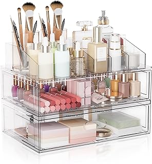
Clear Stackable Makeup Organizer with Drawer
Clear Stackable Makeup Organizer with Drawer has been one of the most consistently praised picks in this category. 302 reviewers averaged 4.5/5.
4. Engage Multiple Senses with Thoughtful Marketing

Shopping for face serums should feel like a mini spa trip. Sensory marketing is huge right now, and it’s only going to get bigger by 2026. You can’t just rely on pretty boxes anymore. When I walk into a store, I want to smell something calming. A faint hint of lavender or sweet orange is perfect. Skip the heavy, synthetic perfumes. They give me an instant headache and make me want to leave. I also love when stores play soft, lo-fi background beats instead of loud pop music. I’m talking about those chill, instrumental tracks that make you feel like you’re in a cool coffee shop. It lowers your heart rate. But the most important sense is touch. I was at Sprouts last month, browsing their natural beauty section, and I picked up a bottle of The Ordinary’s “Buffet” + Copper Peptides 1% serum ($32.80 for 1 oz). The frosted glass bottle has this incredible, slightly grippy texture. It feels heavy and cold in your hand. I want to hear the clinking of glass jars. It makes the whole space feel alive and vibrant. Stores need to display products unboxed so we can actually touch the packaging. If I’m spending thirty bucks on 1 oz of liquid, I want to feel the weight of the glass. The tactile experience creates an immediate emotional connection. You might also like: 15 Lovely Aesthetic Luxury Skincare to Inspire Your Next Project
5. Design for Blue Beauty and Sustainability Transparency

I’m completely over brands that use excessive plastic wrapping. Sustainability isn’t just a trend anymore. Consumers want radical transparency. I love seeing stores that actively promote “Blue Beauty,” which focuses on protecting our oceans and marine ecosystems. I recently visited a high-end beauty shop that used fixtures made entirely from recycled ocean plastic. It looked incredibly chic, not cheap at all. They also had a massive refill station for liquid cleansers. You just bring in your empty glass bottle and pump in exactly 8 oz of fresh product. The heavy stainless steel pump dispensed the exact amount with a satisfying squelch. Tatcha does a beautiful job with their refillable pods for the Water Cream ($72.00 for a 1.7 oz refill). Seeing those empty refill pods displayed on a shelf tells me the brand actually cares about waste. It makes me feel like I’m doing something good for the planet. Plus, the refill stations just look incredibly modern. If you’re setting up a shop, you need clear wall graphics explaining where your ingredients come from. I won’t buy a product if I can’t figure out its environmental impact. I made the mistake of buying a cheap scrub a few years ago, only to realize it was full of microplastics that destroy coral reefs. Never again. Highlighting eco-friendly materials builds immediate trust. You might also like: 15 Gorgeous Aesthetic Glass Skin That Changed Everything
6. Create Clear Visual Hierarchy and Uncluttered Displays

There is nothing worse than a cluttered, chaotic store aisle. I get incredibly overwhelmed when a shop stacks fifty different bottles on a single shelf. A brilliant skincare store design relies on strict visual hierarchy. The most popular, high-demand items need to be exactly at eye level. That’s usually between 55 and 65 inches from the floor. I noticed Costco does this beautifully in their premium beauty section. They place the massive two-packs of SK-II or Olay right where you naturally look against those towering steel racks. If you want to highlight a hero product like Drunk Elephant’s Protini Polypeptide Cream ($68.00 for 1.69 oz), it deserves its own pedestal, not a crowded corner. Display fixtures don’t have to be insanely expensive. You can get a basic, well-lit acrylic stand for about $19.00, or invest in a secure glass cabinet for around $169.00. Costco usually does this well, but I’ve seen smaller shops put heavy glass bottles on the bottom shelf where you can’t reach them comfortably. It’s a huge mistake. You shouldn’t have to squat down to read a label. Keep the best stuff right where we can grab it. Retail spaces need negative space around the products to let them breathe. When a shelf is uncluttered, my eye is instantly drawn to the targeted treatments. It makes the shopping experience feel calm instead of frantic. You might also like: 15 Beautiful Aesthetic Vision Board Skincare to Inspire Your Next Project

EQQUALBERRY Vitamin Illuminating Serum | Niacinamide 4% +
A dependable everyday pick — EQQUALBERRY Vitamin Illuminating Serum | Niacinamide 4% + Brightening pulls in 101 ratings at 4.5 stars. Not flashy, just solid.
7. Integrate Digital Storytelling and Interactive Elements

I hate having to track down a sales associate just to ask if a serum contains alcohol. Interactive digital screens are the best thing to happen to retail. Imagine picking up a bottle of The Ordinary’s Niacinamide 10% + Zinc 1% ($6.00 for 1 oz), and a small screen on the shelf instantly recognizes the product and starts playing a 30-second video tutorial. I just tapped the glass, and a crisp, high-definition video popped up. It showed the exact milky texture, listed every single ingredient, and explained how to layer it without pilling. I saw this setup at a concept store in Chicago, and it was brilliant. It completely empowers the shopper. I don’t want to stand in the aisle squinting at a tiny font on the back of a box while furiously googling reviews on my phone. It feels like having a tiny dermatologist right on the shelf. I honestly wish every store did this. Having a dedicated screen right next to the display solves that problem instantly. I’ve bought so many products I didn’t plan on buying just because a short, snappy video explained exactly what it would do for my redness. If you build a store, place a small digital display next to your top five bestsellers. It reduces the pressure on your staff entirely.
8. Prioritize Skinimalism and Ingredient-Focused Merchandising

The days of the ten-step routine are officially over. I’m fully embracing “skinimalism” now. I want three highly effective products, not a drawer full of mediocre ones. Stores need to reflect this shift in their layout. Instead of grouping everything by brand name, organize the aisles by skin function. I saw this at a Kroger recently in their revamped beauty section, and it blew my mind. They swapped out the cheap plastic dividers for sleek, frosted acrylic. They had a whole shelf dedicated just to “barrier repair” and another for “deep hydration.” It makes so much more sense. If my skin barrier is wrecked from using too much retinol, I don’t want to hunt through five different brand displays to find a ceramide cream. I want all the barrier-first options in one spot. Olive Young, the massive K-beauty retailer, does this perfectly. When I organize my own vanity, I keep my hydrating toners separate from my active exfoliants. Stores should do the same. If I’m looking for the Paula’s Choice 2% BHA Liquid Exfoliant ($35.00 for 4 oz), I want to see all the BHA options side-by-side so I can compare prices and textures. I don’t want to play guessing games with active ingredients. Put the heavy hitters together so we can compare. Organizing by concern makes the shopping trip faster and way less frustrating.
9. Offer Life-Stage Focused Product Curation

Marketing skincare purely by age feels incredibly outdated. I’m so tired of seeing signs that say “For Mature Skin 50+.” It feels exclusionary and clinical. A much better approach is curating products by “life stage.” I visited a boutique that had a section called “Foundational Skincare” aimed at Gen Alpha and young teens. It featured gentle, fragrance-free cleansers and basic gel moisturizers in brightly colored, squishy silicone bottles that look like candy. Right across from it was a section labeled “Longevity & Wellness.” This is where they placed rich, restorative products like Tatcha’s The Longevity Youth Restoring Cream ($110.00 for 1.7 oz). This framing changes everything. It makes beauty feel inclusive. I personally shop for products based on what my skin is going through, not my birth year. Sometimes I’m dealing with stress breakouts, and sometimes I need intense, rich hydration because I’ve been traveling. It takes the stigma out of buying richer creams. We all need different things at different times. Grouping products by these life phases or current skin states makes a lot of sense. Curating by life stage prevents massive skincare mistakes and helps shoppers find exactly what their face actually needs right now. If your signs still sort people by decades, you’re doing it wrong.

Eclat Skincare Vitamin C Serum – Skin Care for Dark Spots
A dependable everyday pick — Eclat Skincare Vitamin C Serum – Skin Care for Dark Spots pulls in 753 ratings at 4.5 stars. Not flashy, just solid.
10. Design an Engaging and Visible Checkout Area

The checkout counter is your last chance to make an impression, and most stores completely waste it. I can’t stand standing in line staring at a blank wall or a messy pile of receipts. You need to make this area irresistible. Think about the checkout line at Trader Joe’s. You know how you always end up with dark chocolate peanut butter cups in your cart? Skincare stores should do the exact same thing with travel-sized items. I’m a sucker for a good dump bin filled with single-use sheet masks or mini serums. Last month, I was waiting to pay, and I saw a display box with Drunk Elephant’s The Littles set ($74.00 for six travel-sized items). Even though it’s pricey, the miniature bottles looked so cute and accessible that I grabbed one without thinking. I also love seeing little $3.99 lip balms or 0.5 oz hand creams in glass bowls right next to the register. It encourages those last-minute impulse buys. I end up spending an extra twenty bucks every single time. It’s a brilliant strategy. Just keep it organized. If the bins look like a rummage sale, I won’t touch them. Clean, well-lit acrylic trays filled with colorful, inexpensive minis will absolutely boost your average order value.
11. Use Pop-Ups for Immersive Brand Storytelling

Pop-up shops used to just be folding tables with a cash register. Now, they’re completely immersive worlds. I went to The Ordinary’s “The Secret Ingredient” pop-up in New York, and it completely changed my perspective on the brand. They didn’t just stack boxes of serum. They created a multi-sensory production that visually demonstrated the hidden costs of celebrity endorsements in the beauty industry. It was brilliant. It felt like walking through a futuristic art exhibit. They had these massive, interactive installations that showed exactly why their products are so affordable. I remember walking through a neon-lit hallway that felt like a science lab. It wasn’t just about selling their dropper bottles ($9.00 for 1 oz). It was about challenging industry norms and building massive brand affinity. It makes the brand feel so much bigger than just a bottle. You leave feeling like you learned a secret. If you run a physical store, you should dedicate a front corner specifically for rotating pop-up experiences. Change it every month. One month it could be a floral installation highlighting botanical ingredients, and the next month it could be a minimalist, clinical setup. It gives me a reason to keep coming back. I won’t visit a store twice a month if it always looks exactly the same.
12. Create Sensorial Synergy with Unique Product Packaging

By 2026, packaging isn’t just going to hold the product. It has to offer emotional comfort and a multi-sensory experience. I’m incredibly picky about packaging. If a pump feels flimsy or a cap doesn’t screw on tight, I’ll never buy it again. I want packaging that feels heavy, intentional, and satisfying. I’ve got this one night cream that comes in a heavy frosted glass jar with a magnetic spatula that snaps perfectly onto the lid. Every time I hear that little click, it gives me a tiny hit of dopamine. It snaps closed with this heavy, metallic thud. I want a lid that feels like a heavy vault door. It just screams quality. It upgrades my entire evening routine from a chore into a luxurious ritual. When designing a store, you have to display these tactile features. Don’t trap a beautiful, heavy glass bottle inside a cheap cardboard box. Let people feel the satisfying magnetic closures. Let them feel the smooth, matte finish of a silicone tube. I once bought the Elemis Pro-Collagen Cleansing Balm ($68.00 for 3.5 oz) simply because the jar had a subtle, embedded fragrance. Everyday products need to feel like memorable moments. If the packaging feels cheap when I pick it up, I automatically assume the formula inside is cheap, too. Let shoppers actually touch the bottles. Trust me on this.
I’m honestly so excited to see how retail spaces evolve over the next few years. The days of sterile, boring aisles are totally behind us. If you’re designing a space or just love analyzing retail setups like I do, focus on how the space makes people feel. I personally swear by stores that let me test, touch, and learn without feeling pressured. It completely changes the way I discover new favorites. Share it with your favorite boutique owner. We all deserve better lighting and cooler displays. If you found these insights helpful, please save or pin this article for your next big project. Let’s make beauty shopping fun again.

Yeamon Gua Sha Facial Tools and Face Roller Set
A dependable everyday pick — Yeamon Gua Sha Facial Tools and Face Roller Set pulls in 1 ratings at 4.5 stars. Not flashy, just solid.
Frequently Asked Questions
Why is skincare store design so important for sales?
Good skincare store design directly impacts how long shoppers linger. When you use proper lighting and uncluttered shelves, customers feel relaxed and confident, which naturally boosts sales and encourages them to test new products.
What kind of lighting is best for a beauty store?
You absolutely need high Color Rendering Index (CRI 90+) lighting. This mimics natural daylight and prevents products from looking yellow or cheap, ensuring textures and packaging look premium and true-to-life.
How should I organize skincare products on the shelves?
Skip organizing purely by brand. Instead, group products by skin function or concern, like a dedicated section for barrier repair or deep hydration. This skinimalism approach makes it way easier for shoppers to find what they need.
Are AI smart mirrors worth it for retail spaces?
Yes, they’re incredibly effective. AI skin analysis tablets help the 24 percent of shoppers who don’t know their skin type. It removes the guesswork, builds immediate trust, and drastically increases conversion rates right in the aisle.
