What’s Inside
- Embrace Emotional Minimalism in Your Skincare Logo Design
- Use Nature-Inspired Tones Like Seafoam and Algae
- Master Color Psychology for a Soothing Skincare Logo Design
- Choose Typography That Speaks Your Brand’s Language
- Design for Scalability on Tiny Lip Balm Tubes
- Invest in Professional Design Services Upfront
- Try Tactile 3D Logos for a Premium Feel
- Reflect Your Core Ingredients Visually
- Avoid Overly Complex and Forgettable Designs
- Don’t Overlook the Favicon and Adaptive Branding
Last Tuesday at Whole Foods, I stared at a chaotic shelf of serums, realizing that bad skincare logo design can ruin a brand. I was standing in the beauty aisle under those harsh fluorescent lights, trying to read the tiny, messy script on a label. I couldn’t decipher a single word. My fingers slipped on the glass, and I nearly dropped a forty-dollar bottle onto the concrete floor. That near-disaster reminded me of a hard truth. Designing a visual identity isn’t just about making things look pretty on a mood board. It’s about instant recognition when a tired shopper stares at a crowded shelf. If your branding makes a customer’s brain hurt, they won’t buy your product.
I’ve spent years analyzing what makes a beauty brand stick. I’m going to walk you through how to build a visual identity that works, without making the expensive mistakes I’ve seen countless indie brands make. We’re skipping the vague advice and getting right into the specific fonts, colors, and layouts that sell products in the real world. It took me years to figure that out, no exaggeration.
1. Embrace Emotional Minimalism in Your Skincare Logo Design

I remember walking through the beauty section at Target last month, dragging my red plastic basket across the linoleum. My eyes went straight to the display for The Ordinary. In 2026, emotional minimalism is dominating the shelves, and for good reason. It focuses on clean lines, simple typefaces, and limited color palettes to evoke calm and authenticity. The Ordinary nails this. They use a strictly textual logo with the Raleway font. When you pick up a bottle of their Niacinamide 10% + Zinc 1% ($6.00 for a 1 oz dropper bottle), the stark white label with plain black text tells your brain that this product is clinical, transparent, and effective.
I tried to design a label for a homemade face oil a few years ago. I thought I needed intricate watercolor flowers and swirling cursive to make it look premium. It looked like a messy wedding invitation. When I stuck it on an amber glass bottle, the text was unreadable. Skip the clutter. You really only need two or three primary colors to stay sophisticated. Glossier does this perfectly with soft styling and an unpretentious font. A minimalist aesthetic strips away visual noise. It tells your customer exactly what they’re getting without shouting.
2. Use Nature-Inspired Tones Like Seafoam and Algae

If you’re formulating with botanical extracts, your branding needs to whisper “earthy” before the customer even unscrews the cap. I was browsing the aisles at Sprouts recently, smelling that mix of spices and produce. I stopped to look at the natural beauty endcap. Brands signaling eco-consciousness are leaning into nature-inspired tones for 2026. We’re talking seafoam greens, deep algae blues, soft muted neutrals, and rich earthy browns.
Origins is a classic example. They use a simple, light green tree emblem. When you buy their Mega-Mushroom Relief & Resilience Soothing Treatment ($42.00 for a 6.7 oz bottle), the dark green plastic and the minimalist tree logo make you think of damp forests and pure ingredients. I swear by incorporating subtle leaf motifs if you’re an organic brand. But learn from my mistakes. I once bought a “natural” vitamin C serum with a bright, aggressive neon green logo. I assumed it was zesty. It smelled like artificial floor cleaner and gave me a horrible rash. Neon colors scream synthetic chemicals. Stick to muted, biophilic elements that mimic actual nature. It builds subconscious trust before the product even touches their skin.
3. Master Color Psychology for a Soothing Skincare Logo Design

Costco trips overwhelm me, especially hitting those massive pallets of beauty products under towering steel shelves. But color psychology is an anchor in those loud environments. Colors influence how we perceive a formula’s texture, scent, and purpose before we open the box. Take blue. It universally evokes trust, hydration, and calmness. Nivea uses that iconic, rich blue tin for a reason. When you grab a Nivea Creme ($1.25 for a 1 oz tin at Walmart), that deep blue packaging makes your brain expect a thick, protective barrier cream. It feels safe. You might also like: 15 Lovely Tips Korean Skincare That Changed Everything
Green signifies naturalness and renewal. Purple is the universal shortcut for nighttime repair and luxury. Tatcha uses a gorgeous, soft lilac for their branding. When you open a heavy glass jar of Tatcha The Dewy Skin Cream ($72.00 for a 1.7 oz jar), the heavy purple glass and the delicate gold logo make the experience feel expensive. Black suggests sleek authority, which is why NARS uses it for their packaging. I’ve seen indie brands try to use bright red for a sensitive skin moisturizer. It’s a massive disconnect. Red signals heat and energy. When my skin is irritated, I don’t want red. I want cool blues, crisp whites, or soft greens. Choose your logo color based on the feeling you want your customer to have. You might also like: 15 Gorgeous Aesthetic Anti Aging Skincare You Haven’t Thought Of

COSRX Vitamin E Vitalizing Sunscreen
Honestly, COSRX Vitamin E Vitalizing Sunscreen surprised me — sturdier than it looks in the photos, and over 42 buyers gave it 4.5 stars.
4. Choose Typography That Speaks Your Brand’s Language

The font you select is your brand’s speaking voice. Imagine running your fingers over the embossed lettering on a heavy glass bottle. Does it feel modern or classic? Sans-serif fonts project modernity, science, and accessibility. L’Oreal uses a clean sans-serif. When you buy a jar of L’Oreal Revitalift ($23.99 for a 1.7 oz jar), the typography feels straightforward. Aveda and NARS also use sans-serif to appeal to a contemporary audience. You might also like: 15 Gorgeous Aesthetic Glass Skin That Changed Everything
Conversely, serif fonts feature those tiny “feet” at the ends of the letters. These convey tradition, reliability, and old-world luxury. Clarins and Lancôme rely on them. A bottle of Clarins Double Serum ($132.00 for a 1.6 oz pump) looks like it belongs on a vintage vanity table because of that classic text. This changed how I view brand identity. I used to think fonts didn’t matter. Then I tried to read a curly script on a tiny 0.5 oz eye cream jar. It was a nightmare. Your typography must remain legible at microscopic sizes. If your customer has to squint to read your name, they’ll walk right past it. Pick a font that is bold, clean, and reads clearly on a massive billboard or a tiny sample sachet.
5. Design for Scalability on Tiny Lip Balm Tubes

This brings me to a common mistake that breaks my heart. You design a gorgeous, intricate logo on a large laptop screen. It looks stunning. Then you print it on a tiny lip balm tube, and it becomes an unrecognizable smudge. I was standing in the checkout line at Kroger last week, staring at the impulse-buy racks. I picked up a tube of Burt’s Bees Beeswax Lip Balm ($3.99 for a 0.15 oz tube). Their logo is detailed, sure, but they simplify it for the cylindrical tube. The text is sharp, and the yellow color blocking does the heavy lifting.
Your logo must look impactful across diverse mediums. It needs to work as a tiny social media avatar and a large storefront banner. I made this mistake years ago. I designed a logo for a friend’s soap business with delicate little vines wrapping around the letters. On the computer, it was art. When we printed the stickers for the 4 oz bars, the vines bled together. It looked like a green blob. Avoid overly intricate details. If your logo relies on hair-thin lines to make sense, it’s going to fail. Keep it scalable. Keep it bold.
6. Invest in Professional Design Services Upfront

I know it’s tempting to use a free online logo generator when starting. Budgets are tight. But those free tools often spit out generic, soulless graphics that a thousand other brands are already using. If I see one more generic lotus flower logo, I’m going to scream. Investing in professional design upfront can save you thousands in costly rebranding later. I learned that the hard way.
For a customized logo, expect to pay a freelance designer between $300 and $1,000. Full design agencies usually charge $2,500 to $10,000 or more. Think about a brand like CeraVe. Their logo is simple. Just text with a specific blue and green color block. But it’s instantly recognizable. When you buy a massive bottle of CeraVe Daily Moisturizing Lotion ($14.99 for a 12 oz pump), that logo screams “dermatologist approved.” It doesn’t look cheap; it looks clinical. A professional knows how to balance that vibe. My friend used a free logo maker for her bath salt line and ended up with something that looked like it belonged to a plumbing company. Pay a professional. It’s an investment in your brand’s permanent real estate.

Vtopmart 3 Tier Clear Makeup Organizer with Drawer
A dependable everyday pick — Vtopmart 3 Tier Clear Makeup Organizer with Drawer pulls in 19 ratings at 4.5 stars. Not flashy, just solid.
7. Try Tactile 3D Logos for a Premium Feel

We’re seeing a shift toward tactile 3D logos for 2026. I’m not talking about the glossy, fake-looking 3D text from the early 2000s. I’m talking about subtle depth, gentle shadows, and soft bevels that feel touchable. It creates a premium presence. I noticed this while wandering Target. I picked up a bottle of Naturium Niacinamide Serum 12% Plus Zinc 2% ($16.00 for a 1 oz bottle). Their packaging often uses raised lettering or embossed textures that catch the store lighting perfectly.
When a logo looks like it has physical weight, our brains associate it with a higher price point and better quality. It’s a psychological trick. You can achieve this digitally by adding a faint drop shadow or a slight gradient that mimics a bevel. I swear by embossed labels if you can afford the printing costs. The first time I ran my thumb over a raised, tactile logo on a heavy glass bottle, it felt luxurious. I didn’t care what was inside yet; I just wanted it on my bathroom counter. It bridges the gap between the digital screen and the physical product.
8. Reflect Your Core Ingredients Visually

Your logo shouldn’t just be a pretty picture. It needs to communicate your brand’s philosophy or hero ingredient. If your brand is built around scientific innovation, your logo should reflect that. Look at LifeCell. Their branding incorporates elements that look like molecular structures. When you’re dropping money on the LifeCell South Beach Skincare All-In-One Anti-Aging Treatment ($189.00 for a 2.54 oz tube), you want to feel like you’re buying cutting-edge science, not just basic lotion. The logo reinforces that authority.
On the flip side, if you’re formulating with raw, organic botanicals, you need a different visual language. I was at Trader Joe’s last week and grabbed a bottle of their Tea Tree Oil ($6.99 for a 1 oz bottle). The packaging is incredibly simple, featuring basic leaf motifs or apothecary-style text. It tells you the product is a single, natural ingredient. Most people get this wrong by trying to mix aesthetics. You can’t have a high-tech, metallic logo if your main selling point is organic, cold-pressed rosehip oil. It confuses the customer. Pick your lane. Let your logo be a visual shorthand for what’s inside the jar.
9. Avoid Overly Complex and Forgettable Designs

Here is a brutal test for your logo. Look at it for ten seconds. Close your eyes and try to sketch it from memory. If you can’t, it’s too complicated. Expert advice suggests that an effective logo should be simple enough to draw from memory. If your logo features a highly detailed mandala, a realistic portrait, or five overlapping fonts, it risks being forgettable.
Simplicity is the key to memorability. Think about Glossier. It’s just text. Think about the Nike swoosh. Think about the bold font of Milk Makeup. When I buy a tube of Glossier Milky Jelly Cleanser ($19.00 for a 6 oz bottle), I don’t need to decipher a complex crest. The simple pink and white branding is recognizable from across the room. I used to think simple meant boring. I was wrong. Simple means confident. When your formula is good, you don’t need to hide behind a messy logo. Complex designs create a nightmare when printing. A delicate watercolor logo might look great on a flat box, but it will look like a muddy mess on a curved plastic tube. Keep it clean.
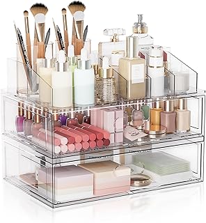
Clear Stackable Makeup Organizer with Drawer
Clear Stackable Makeup Organizer with Drawer has been one of the most consistently praised picks in this category. 302 reviewers averaged 4.5/5.
10. Don’t Overlook the Favicon and Adaptive Branding

This is a lesser-known tip becoming crucial for 2026: you need to think about adaptive logos. We don’t just interact with brands on store shelves. We interact on smartwatches, in augmented reality apps, and across twenty browser tabs. This is where the favicon becomes important. That 16×16 pixel icon in your browser tab. If your full logo is a long wordmark, it’s going to be an illegible speck.
You need a simplified version specifically for these micro-spaces. Look at Fenty Beauty. When you’re shopping online for the Fenty Beauty Pro Filt’r Soft Matte Longwear Foundation ($40.00 for a 1.08 oz bottle), their website favicon is usually just a stark, bold “FB.” It maintains their brand presence even when the full logo isn’t visible. An adaptive logo system means you have a primary logo for large boxes, a stacked version for Instagram, and a tiny icon for favicons. I ignored this when I launched a blog years ago. My browser tab showed a broken image icon for months. It looked so unprofessional. Design for every touchpoint from day one.
Let’s wrap this up. Building a strong visual identity isn’t just about picking your favorite color. It’s a strategic puzzle. You have to balance color psychology, font legibility, and printing constraints. The next time you’re wandering the aisles at Target or Whole Foods, really look at the boxes. Notice the textures, the spacing of the letters, and the colors. Pay attention to what your hands naturally reach for. That’s the secret. It’s invisible, but it dictates everything we buy. I highly recommend starting a physical swipe file. Buy a few cheap products just for their packaging. Study them. Feel the labels. See how the ink sits on the plastic. It’s the best education you can get. If you found this helpful, please pin this article to your Pinterest board so you can reference it when you’re ready to hire a designer. Your future self will thank you. Trust me on this.
Frequently Asked Questions
How much does professional skincare logo design cost?
Hiring a freelance designer typically costs between $300 and $1,000, depending on their experience. If you hire a full design agency for comprehensive branding, expect to pay anywhere from $2,500 to $10,000 or more.
What is emotional minimalism in beauty branding?
Emotional minimalism is a design trend focusing on clean lines, simple sans-serif typefaces, and limited color palettes. It strips away visual clutter to evoke feelings of calm, transparency, and clinical effectiveness.
Why are favicons important for skincare brands?
Favicons are the tiny 16×16 pixel icons in browser tabs. Because full logos are unreadable at that size, you need a simplified, adaptive version of your logo to maintain brand recognition when customers shop online.
What colors are best for natural skincare products?
Nature-inspired tones like seafoam greens, algae blues, and earthy browns are ideal. These biophilic elements subconsciously signal organic ingredients and purity to consumers, unlike harsh neon colors which suggest synthetic chemicals.
