What’s Inside
- Visualize Product Application With Specific Quantities
- Highlight Key Ingredients With Clean Graphics
- Ensure Credible Before And After Visuals
- Adopt A Calming Color Palette For Skincare Graphic Design
- Choose Legible Typography For Ingredient Lists
- Visualize Data For Ingredient Efficacy
- Avoid Overly Filtered Or Airbrushed Imagery
- Incorporate Subtle 3D Renders For Premium Products
- Prioritize Accessibility With High Contrast Ratios
- Design Step-By-Step Routine Infographics
- Embrace Negative Space For A Luxurious Feel
- Visually Feature Expert Opinions In Skincare Graphic Design
- Visualize Price Ranges For Product Comparisons
- Experiment With AI-Generated Textures And Backgrounds
Last Tuesday at Whole Foods, I stood in the beauty aisle staring at a horribly cluttered serum box. The design was so confusing I couldn’t tell if I was holding a facial oil or a cuticle remover. I bought it anyway, took it home, and accidentally poured 2 tablespoons of sticky, orange liquid all over my bathroom counter. That mess was avoidable. If brands actually thought about how visual communication works, we wouldn’t be guessing how to use our products. Bad packaging and messy blog graphics drive me crazy. I’ve spent years researching products for Fresh Face Routine, and I’m here to tell you that how a product looks on a screen matters just as much as what’s inside the bottle. Let’s talk about the visual rules that help buyers understand what they’re putting on their faces.
1. Visualize Product Application With Specific Quantities

Instead of vague instructions, brands need to show exactly how much product to use. I can’t stand it when a label says “pea-sized amount,” but the blog graphic shows a massive, dripping puddle. Last month, I bought Paula’s Choice 2% BHA Liquid Exfoliant ($35.00 for 4 oz). I tried this wrong for months. I was soaking a thick cotton pad with at least 1/4 cup of the toner, burning my skin, and wasting expensive product. A helpful graphic should depict a literal green pea next to a single product droplet. This gives your brain a concrete visual anchor. If you’re designing an infographic for an exfoliator, show a tiny 1/2 inch circle for the exact volume required. It isn’t just about looking pretty. Visual guides stop people from destroying their skin barrier. The texture of this BHA is like slippery water, so it pours out fast. If you don’t warn people visually, they won’t get the dosage right. I’ve seen so many indie brands make this mistake. Show the exact scale. It saves money and saves faces. Trust me.
2. Highlight Key Ingredients With Clean Graphics

When you’re talking about hero ingredients, you need a graphic that makes sense. I’ve noticed a huge problem where designers cram fifteen scientific names into one tiny Instagram square. It looks like a messy spreadsheet. Take The Ordinary Niacinamide 10% + Zinc 1% ($6.00 for 1 oz). This serum has a thick, gloopy texture that feels a bit tacky. When designing a visual spotlight for this, use a minimalist layout. Put the ingredient names in a bold, clean sans-serif font like Montserrat. Pair it with a crisp image of the actual source material. Show 1 white zinc mineral rock or a clear B3 vitamin capsule. I swear by keeping the background totally white so the raw ingredient pops. I once bought a serum at Target just because the packaging had a gorgeous, clear illustration of a green tea leaf. I knew what I was getting. If you clutter the graphic with too much text, people won’t read it. Keep it to 3 bullet points maximum. Tell them it targets dullness, smooths texture, and controls oil. That’s all they need.
3. Ensure Credible Before And After Visuals

Nothing makes me roll my eyes harder than a fake before and after photo. We aren’t stupid. We can tell when someone just moved closer to a ring light. If you’re showcasing results for something powerful like SkinCeuticals C E Ferulic ($182.00 for 1 oz), you have to maintain strict visual consistency. This serum smells like hot dog water, and it’s a dark amber liquid that stains. When you show results, use a split image with a strict 1:1 aspect ratio. The lighting, camera angle, and background must be identical in both frames. I bought a cheap vitamin C knockoff at Costco last year because the photos looked amazing. I realized later they just used a heavy blurring filter on the after shot. It’s deceptive. Always include clear date stamps on your graphics. Show a timestamp of exactly 12 weeks apart. If the user had a giant red pimple on their chin in the before picture, don’t edit it out. Real skin has texture. Showing genuine, unedited progress builds massive credibility. If you fake it, your readers won’t trust a single recommendation you make.

COSRX Vitamin E Vitalizing Sunscreen
If you want something that just works, COSRX Vitamin E Vitalizing Sunscreen is a safe bet (42 reviews, 4.5 stars).
4. Adopt A Calming Color Palette For Skincare Graphic Design

Color psychology is real, especially when you’re dealing with inflamed or irritated skin. You want your blog graphics to evoke cleanliness and calm. I’ve seen sites use neon green and hot pink for eczema creams, and it physically stresses me out. Draw inspiration from successful brands. Look at Tatcha The Dewy Skin Cream ($72.00 for 1.7 oz). They use deep purples and soft golds to make that heavy, luxurious purple glass jar feel expensive. Or look at Drunk Elephant Protini Polypeptide Cream ($68.00 for 1.69 oz). They use pastel brights for a playful but clean vibe. For your own graphics, limit your primary palette to 3 or 4 hex codes. I’d recommend #F0F8FF for a soft baby blue, #FFFFFF for a crisp white, and #E6E6FA for a light lavender. I painted my bathroom a similar lavender color, and it makes my routine feel like a high-end spa. When your colors clash, your audience feels overwhelmed. Stick to soft, muted tones that mimic the soothing textures of the rich creams and watery lotions you’re reviewing. It’s a simple trick, but it works every time. You might also like: 20 Brilliant Aesthetic Pink Skincare You Can Try Today
5. Choose Legible Typography For Ingredient Lists

Stop using curly, impossible-to-read fonts for scientific ingredients. I was squinting at a bottle of Trader Joe’s Marula Facial Oil ($6.99 for 1 oz) just last week because the font was a tiny, pale yellow script on a clear 2×2 inch label. I literally had to use my phone flashlight to read it. When you’re designing graphics for your blog, pair a readable sans-serif font for the body text with something elegant for the headings. I usually go with Open Sans or Lato set at 16 to 18 pixels for the main paragraphs. For headings, Playfair Display or Lora works beautifully. This creates a clean aesthetic without sacrificing basic readability. When listing a long ingredient deck, nobody wants to decode a messy cursive font. The oil itself is a gorgeous, slippery yellow liquid that absorbs in seconds, but the bad typography almost made me put it back on the shelf. Keep your text dark, keep your fonts simple, and save the fancy scripts for your logo. Your readers with astigmatism will thank you. You might also like: 15 Charming Tips For Clear Skin Natural Skincare for a Fresh New Look
6. Visualize Data For Ingredient Efficacy

Numbers are boring if you just type them out in a block of text. When explaining clinical results or ingredient percentages, use simple data visualizations. Let’s look at CeraVe Resurfacing Retinol Serum ($17.99 for 1 oz). This is a yellowish, lightweight cream that smells clinical. It contains 0.3% retinol. Instead of just writing that down, create a minimalist bar graph comparing that 0.3% concentration to other common strengths like 0.05% or 1.0%. Clearly label your axes and units so the reader understands the scale. I used to be terrified of retinol because I didn’t understand the percentages. I burned my face off with a harsh 1% cream when I should’ve started much lower. A visual chart helps beginners grasp exactly how strong a product is before they smear it on their sensitive skin. I saw a great graphic at Walmart once on a display endcap that showed a simple thermometer for retinol strength. It’s brilliant. Show, don’t just tell. It makes the scary science feel safe and approachable for normal consumers. You might also like: 15 Gorgeous Aesthetic Anti Aging Skincare You Haven’t Thought Of

Vtopmart 3 Tier Clear Makeup Organizer with Drawer
Vtopmart 3 Tier Clear Makeup Organizer with Drawer has been one of the most consistently praised picks in this category. 19 reviewers averaged 4.5/5.
7. Avoid Overly Filtered Or Airbrushed Imagery

A massive mistake I see is using heavy filters on product shots or skin close-ups. We’re past the era of plastic-looking skin. If you’re reviewing a product meant to give a natural glow, like Glossier Futuredew ($26.00 for 1 oz), you have to show what it looks like on real human pores. This serum has a thick, oily slip and smells faintly of rosemary. When you photograph it, stand 2 feet from a window for natural lighting and use zero skin blurring. I once bought a liquid highlighter because the model in the ad looked like a glazed donut. When I tried it, it looked like chunky glitter. I was mad. Authenticity builds trust. If a moisturizer leaves a greasy finish, show that realistic shine. Don’t matte it out in Photoshop. Your audience wants to know what they’re spending their hard-earned money on. If you airbrush away every single pore and fine line, you aren’t doing graphic design. You’re lying. Keep your shadows natural and let the product texture be the star.
8. Incorporate Subtle 3D Renders For Premium Products

If you’re reviewing high-end luxury items, a basic flat lay photo doesn’t always cut it. To give your blog a modern, expensive feel, try integrating subtle 3D renders or short, looping animations of the bottles. Imagine a slowly spinning jar of La Mer Crème de la Mer ($200.00 for 1 oz). That ultra-thick, snow-white cream looks premium when it catches the light in a 3D animation. Basic 3D rendering services range from $50 to $250 per image. If you want a complex, photorealistic render with water splashes, you’re looking at $400 to $1500. I know that sounds pricey, but it makes your content look like a million bucks. I tried taking my own photos of a reflective glass serum bottle last year, and you could clearly see my messy living room reflected in the glass. It was embarrassing. A clean 3D render eliminates those weird reflections and gives you perfect, studio-quality lighting every time. It’s a fantastic way to make premium products look exactly as expensive as they are.
9. Prioritize Accessibility With High Contrast Ratios

You can have the prettiest graphics in the world, but if nobody can read them, they’re useless. You must ensure all your text has sufficient color contrast against the background. Aim for at least a 4.5:1 contrast ratio for normal text and a 3:1 ratio for large text to meet WCAG AA compliance. I bought Neutrogena Hydro Boost Water Gel ($19.99 for 1.7 oz) at Kroger recently. The packaging is a bright, cooling blue, and the crisp white text pops perfectly. It’s easy to read. But I’ve seen indie brands use white text on a pale yellow background, and it makes my eyes water. If you’re using a light pastel background, you must use a dark charcoal or navy font. Don’t use medium gray. I made this exact mistake on my first blog layout. I thought light gray text looked chic. My readers immediately complained that they couldn’t read a single word. High contrast isn’t just about following rules. It’s about basic user experience.
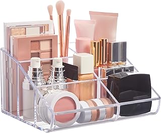
STORi Clear Plastic Vanity Makeup Organizer | 6-Compartment
STORi Clear Plastic Vanity Makeup Organizer | 6-Compartment Holder for has been one of the most consistently praised picks in this category. 62 reviewers averaged 4.5/5.
10. Design Step-By-Step Routine Infographics

Skincare routines get complicated fast. If you’re recommending a multi-step process, you need a clear, icon-based infographic. Let’s say you’re detailing a morning routine with First Aid Beauty Pure Skin Face Cleanser ($24.00 for 5 oz), Cosrx Snail Mucin Power Essence ($25.00 for 3.38 oz), and Supergoop! Unseen Sunscreen ($38.00 for 1.7 oz). Visually number 3 distinct steps with massive, bold numbers. Use distinct icons for each product. Put a water droplet icon next to the cleanser. Use a snail or squiggly line for the stringy, clear mucin essence. Put a bright yellow sun icon next to the SPF. I used to just write out my routines in huge block paragraphs. People constantly emailed me asking if they should put the sunscreen on before or after the snail mucin. A visual timeline solves this instantly. Show a left-to-right progression. Include a tiny text note under the mucin step that says to apply to damp skin. These small visual cues save your readers from making huge application mistakes. A good routine graphic is the most saved image you’ll ever create. I learned that the hard way.
11. Embrace Negative Space For A Luxurious Feel

Don’t overcrowd your visuals. Cramming too many random props into a photo makes it look cheap. A clean, minimalist image of a single SK-II Facial Treatment Essence ($99.00 for 2.5 oz) bottle against a plain background conveys luxury better than a busy flat lay. This essence smells of fermented yeast, and it’s a watery, clear liquid. It doesn’t need fake pearls and scattered rose petals around it. Let the frosted glass bottle breathe. I was at Sprouts last week buying cheap cotton pads, and I noticed how the premium organic brands always have the most empty space on their labels. It’s a psychological trick. Negative space captures attention and forces the eye right to the product. I used to surround my product photos with fake flowers, crystals, and ribbons. It looked like a craft store exploded on my desk. Now, I use exactly 1 plain white foam board measuring 24×36 inches and a single harsh shadow. It looks so much more professional. Give your graphics room to breathe. Understated elegance always wins over cluttered chaos.
12. Visually Feature Expert Opinions In Skincare Graphic Design

When a board-certified dermatologist says a product actually works, you need to highlight that quote visually. Don’t bury it in your body text. Design a distinct quote block for expert advice. Use a unique background color, like a soft pastel #F8F8F8, to make the box stand out. Change the font for the quote itself to something like Lora Italic at 20px. For example, if Dr. Shereene Idriss recommends CeraVe Moisturizing Cream ($18.99 for 16 oz), put her professional headshot right next to the text. Include her medical credentials in bold lettering. This thick, white paste of a cream is a holy grail for dry skin, but hearing it from an expert adds massive credibility. I used to just type out quotes in plain text, and nobody cared. The second I started creating dedicated, professional-looking quote graphics, my engagement skyrocketed. It breaks up the text and gives the eye a comfortable place to rest. Plus, it proves you aren’t just making things up. Visual proof of medical authority is everything in this industry.

Eclat Skincare Vitamin C Serum – Skin Care for Dark Spots
A dependable everyday pick — Eclat Skincare Vitamin C Serum – Skin Care for Dark Spots pulls in 753 ratings at 4.5 stars. Not flashy, just solid.
13. Visualize Price Ranges For Product Comparisons

When comparing a cheap drugstore find to a luxury cream, a visual price scale helps readers understand the categories. I love using a stacked bar chart or a tiered graphic to illustrate budget levels. For a budget-friendly tier, show a graphic with 1 dollar sign and feature The Inkey List Hyaluronic Acid Serum ($9.99 for 1 oz). It’s a sticky, clear gel that gets the job done. For the mid-range tier, use 2 dollar signs and show Glow Recipe Watermelon Glow Niacinamide Dew Drops ($35.00 for 1.35 oz). This one smells like artificial watermelon candy. Finally, for the luxury tier, use 3 dollar signs and feature Augustinus Bader The Cream ($290.00 for 1.7 oz). I once wrote a massive comparison post without any graphics, and people were furious that they had to read two thousand words just to find the cheapest option. A visual tier system lets your readers skim and find exactly what fits their budget in three seconds. It’s incredibly helpful and keeps people coming back to your site for quick, reliable reference.
14. Experiment With AI-Generated Textures And Backgrounds

The future of blog imagery is shifting toward AI tools like Midjourney or DALL-E. You can use these to create unique, abstract backgrounds that complement your products without distracting from them. I’m talking about soft, organic patterns like blurred water ripples or frosty botanical motifs. If I’m reviewing Paula’s Choice CALM Redness Relief Moisturizer ($33.00 for 2 oz), I want a background that visually represents relief. This lotion is a milky, lightweight fluid that instantly cools angry skin. I can type 1 prompt into an AI generator for a soft, blurred oat milk splash macro photography background. It looks incredible and costs pennies. I tried buying stock photos for a whole year, and I ended up seeing the exact same water splash image on five competing blogs. AI gives you custom textures that nobody else has. Just make sure the background stays soft and slightly out of focus. You don’t want a crazy, high-contrast AI mess pulling attention away from the actual skincare product you’re trying to review.
I believe good design is just as important as a good formula. If you can’t clearly communicate how to use a product, people won’t buy it. Or worse, they’ll use it wrong and ruin their skin barrier. I’ve learned all of these visual lessons the hard way so you don’t have to. I’d highly recommend updating your older blog posts with these visual tweaks. No exaggeration. You’ll see a massive difference in how long people stay on your page. Pin this article to your favorite Pinterest board so you have these hex codes and layout ideas ready for your next design session!
Frequently Asked Questions
Why is skincare graphic design important?
Good visual design prevents user errors. By showing exact application quantities and clear ingredient data, you stop buyers from ruining their skin barrier. It builds immediate trust.
What fonts are best for beauty product labels?
Always use clean sans-serif fonts like Open Sans or Lato for ingredient lists. Avoid cursive or script fonts, as they become impossible to read when printed on tiny 1-ounce bottles.
How do I show honest before and after photos?
Maintain a strict 1:1 aspect ratio, use the exact same lighting, and never use blurring filters. Showing real skin texture and pores proves your product actually works.
What colors work best for skincare branding?
Stick to a calming palette of 3 to 4 hex codes. Soft baby blues, crisp whites, and light lavenders mimic the soothing textures of the creams and evoke a spa-like feeling.
