What’s Inside
- Prioritize Mobile-First Skincare Website Design
- Invest in Viscous, Drippy Product Photography
- Craft Benefit-Driven Ingredient Lists
- Build Trust with Raw Social Proof
- Implement Intuitive Navigation and Filters
- Offer Personalized Quizzes for Skincare Website Design
- Ensure Website Accessibility for Everyone
- Show the Texture in Action with Video
- Make the Checkout Process Completely Painless
- Highlight the Formulated Without List
- Create a Dedicated Routine Builder
- Add Interactive Hover States for Ingredients
- Use Color Psychology for Trust
- Automate Replenishment Reminders
Last Tuesday at Whole Foods, I stood in aisle four squinting at my phone. I was trying to load a brand’s site to see if their $24.99 2 oz serum had niacinamide in it. The page took forty seconds to load. That’s when I realized bad skincare design kills sales faster than a bad breakout. I couldn’t get the ingredient list to load, so I put the box back and bought nothing. It’s frustrating. You’re holding a product, but you still need the digital experience to validate your choice. If you’re building a brand, you can’t ignore the digital storefront. Let’s break down how to build a site that actually converts browsers into buyers.
1. Prioritize Mobile-First Skincare Website Design

Design for phones first, then scale up. Over 70% of beauty shoppers buy on mobile. I built my first portfolio site wrong for months. I designed it on a 27-inch monitor, then opened it at the Target checkout. The text was microscopic. I couldn’t click a single button without fat-fingering the wrong link. Rookie mistake. Ensure fast load times. Every second of delay hurts conversions. Aim for under three seconds. You want to avoid bounce rates. In 2026, mobile-first isn’t optional; 79% of e-commerce traffic is mobile. Think about how people shop. They’re scrolling in bed or comparing prices in the aisle. When I buy my CeraVe Hydrating Cleanser (16 oz for $14.99), I’m usually reordering from my phone while brushing my teeth. If the buttons aren’t huge and the layout isn’t simple, I won’t buy it.
2. Invest in Viscous, Drippy Product Photography

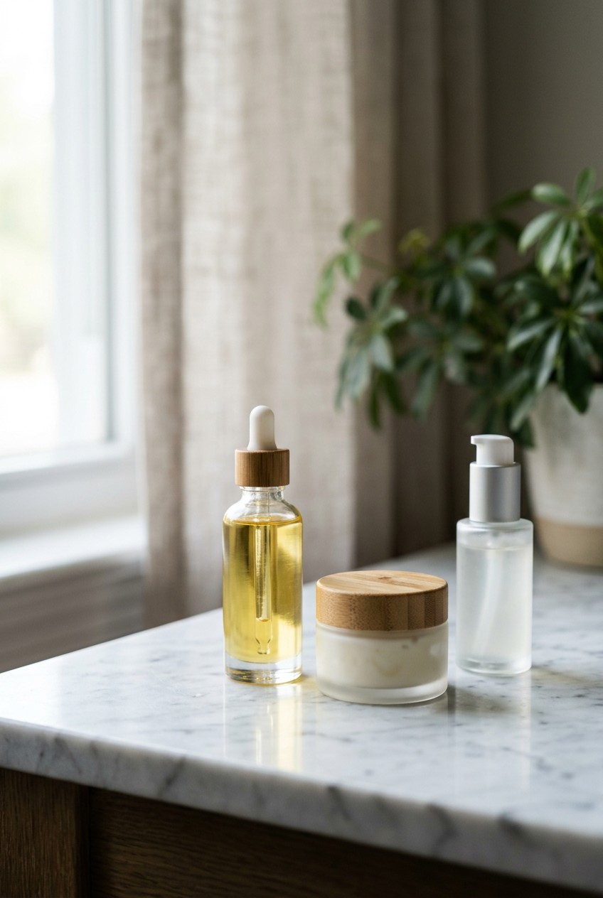
Use high-res images for every product. Show different angles and real-life settings. Include lifestyle photos. Add 360-degree images or short 10-second clips. This helps customers understand the texture. Dr Sam’s Flawless Cleanser (6.7 oz for $25.00) does this well with quick tutorials. Alpha-H Liquid Gold (3.3 oz for $54.00) shows the exact viscosity of their exfoliant. A big mistake is using generic stock images. They imply a cheap product. Skip the fat-free stuff. It tastes like wet cardboard, and generic photos feel the same to a skeptic. I need to see the texture. Is it a thick cream? A watery essence? Show a 1/4 teaspoon dollop on a glass plate. Show the drops falling from a pipette. When I’m spending money, I want to know how it feels before it touches my face. The lighting should be bright, but the texture shots need to be raw. Learned that the hard way.
3. Craft Benefit-Driven Ingredient Lists

Explain what a product does and why it works. Prioritize benefits before the technical stuff. Use bullet points. Avoid jargon. List all ingredients and potential allergens. Brands like HydroPeptide Moisture Reset Face Oil (1 oz for $120.00) do this well. They highlight what they leave out. Last month at Sprouts, I looked at a $9.99 4 oz rosewater spray. The floor was sticky and the store was freezing. I pulled up the site to see the ingredients. It was just a block of Latin. I didn’t buy it. A lesser-known trick: interactive ingredient displays. Let users hover over a complex name to learn more. Magic Spoon does this for cereal. You should do the same. If you use Sodium Hyaluronate, add hover text that explains it in plain English. It makes the science accessible.
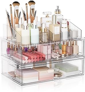
Clear Stackable Makeup Organizer with Drawer
If you want something that just works, Clear Stackable Makeup Organizer with Drawer is a safe bet (302 reviews, 4.5 stars).
4. Build Trust with Raw Social Proof

Display testimonials and star ratings prominently. Put them on product pages. Allow verified buyers to post photos. This reduces hesitation. Placing social proof at the moment of choice helps. CeraVe’s Daily Moisturizing Lotion (12 oz for $13.79) uses testimonials to reinforce its dermatologist-recommended branding. Tools like Yotpo or Okendo help. Basic plans are $15 to $49 a month. I’ve bought so many things because a reviewer posted a dimly lit bathroom selfie. Polished influencer photos don’t sell me anymore. I want the gritty, unedited photos from a tired mom who fixed her dry patches. Don’t fake your reviews. People spot them instantly. If a product has 500 reviews and zero negative ones, I’m suspicious. Leave the three-star reviews up. They make the five-star ones look real. I saw this at Walmart last week. Honest reviews make me trust the brand more.
5. Implement Intuitive Navigation and Filters

Ensure clear categories and minimal dropdowns. You need a visible search bar. Filter by skin type, concerns, and price. Aesop’s Parsley Seed Serum (3.4 oz for $87.00) has brilliant navigation. They let you browse by skin type effortlessly. The Ordinary Niacinamide 10% + Zinc 1% (1 oz for $6.00) lets you filter by active ingredient. Poor navigation is a common mistake. If I have to click four times to find a moisturizer, I’m leaving. Your top menu should be simple. Shop by Concern, Shop by Category, Best Sellers. That’s it. Keep the header clean. I swear by a sticky search bar that stays at the top as you scroll. When a customer remembers they need eye cream, it should be right there. Don’t make them scroll up. You might also like: 20 Beautiful Routine Skin Care Tips Natural Acne Skincare for a Fresh New Look
6. Offer Personalized Quizzes for Skincare Website Design

Use interactive quizzes to recommend products. Ask about concerns and preferences. It makes users feel valued and boosts confidence. ILIA Beauty Super Serum Skin Tint (1 oz for $48.00) does a great job with shade matching. In 2026, hyper-personalization is huge. People don’t want to guess what works for acne. They want an expert. A quiz is a digital esthetician. Keep it short. Five or six questions. Ask about skin goals, sensitivity, and morning routine time. At the end, don’t dump ten products on them. Give them a simple three-step routine. When I take a quiz and it recommends a $300 twelve-step routine, I close the tab. It feels like a cash grab. Recommend a core routine and offer add-ons. You might also like: 20 Charming Aesthetic Videos Night Routine Skincare You’ll Want to Bookmark

Masirs Clear Makeup Organizer
A dependable everyday pick — Masirs Clear Makeup Organizer – 16-Compartment Cosmetic and Jewelry Ho pulls in 258 ratings at 4.5 stars. Not flashy, just solid.
7. Ensure Website Accessibility for Everyone

Strive for WCAG 2.1 Level AA compliance. Use clear navigation and good color contrast. Add alt text to images. Paula’s Choice 2% BHA Liquid Exfoliant (4 oz for $34.00) uses high contrast. It’s easy to read. Don’t use light gray text on white. It looks modern but is unreadable for many. I’ve seen indie brands use pale pink on beige. It’s a nightmare. You’re turning away customers who can’t read your descriptions. Make sure the site works with a keyboard. Accessibility isn’t just a legal requirement; it’s good business. If a customer can’t read the ingredients on your $50 eye cream, they won’t buy it. Keep font sizes at 16px minimum. You might also like: 15 Lovely Aesthetic Luxury Skincare to Inspire Your Next Project
8. Show the Texture in Action with Video

Static photos are fine, but video closes the sale. Use looping, silent videos showing the product on human skin. Glow Recipe Watermelon Glow PHA+BHA Pore-Tight Toner (5 oz for $34.00) uses macro shots of their toner stretching between fingers. It makes you want to touch it. Last month at Costco, I was wrestling a 2-pack of Cetaphil Gentle Skin Cleanser (16 oz for $19.99) into my cart. I dropped my phone trying to pull up a review video. The screen cracked, but the video kept playing. It showed how the cleanser lathered. That visual proof is mandatory. Don’t rely on YouTube. Host clips on your product pages. Show a 1/2 teaspoon being massaged into a cheek. Let the customer see the finish. People buy skincare based on the sensory experience they expect. If your site is static, you’re missing a huge trigger.
9. Make the Checkout Process Completely Painless

Your checkout needs to be fast. Offer Apple Pay, Google Pay, and Shop Pay. Laneige Lip Sleeping Mask (0.7 oz for $24.00) is easy to buy because they support instant checkout. You shouldn’t have to fill out fourteen fields. One rainy night, I was in a Kroger parking lot trying to buy a limited-edition lip balm. The site forced me to create an account, verify my email, and type in my card number. By the time I finished, it was gone. I was furious. I’ll never shop there again. Don’t force account creation. Offer guest checkout. Keep the cart page clean. Remove the top menu once they enter checkout. You don’t want them wandering off to read a blog. Every extra click is a chance for them to change their mind.

Yeamon Gua Sha Facial Tools and Face Roller Set
Honestly, Yeamon Gua Sha Facial Tools and Face Roller Set surprised me — sturdier than it looks in the photos, and over 1 buyers gave it 4.5 stars.
10. Highlight the Formulated Without List

Consumers care about what goes on their faces. Provide a clear list of negative ingredients. Vanicream Gentle Facial Cleanser (8 oz for $8.99) is famous for this. Their brand is built on being free of dyes, fragrance, and parabens. Put this next to the Add to Cart button. Don’t bury it at the bottom. Use icons. A crossed-out circle next to Sulfates works instantly. Many brands only focus on active ingredients. I want to know about the Vitamin C, but I also need to know if it’ll trigger my fragrance allergy. Transparency builds loyalty. If you hide your ingredient list, I assume you’re hiding fillers. Be proud of your clean formulas.
11. Create a Dedicated Routine Builder

Stop selling isolated products and sell routines. A routine builder bundles products together. Good Molecules Discoloration Correcting Serum (1 oz for $12.00) is great, but it works better with sunscreen and a cleanser. Show customers how to layer products. Use a visual timeline. Step 1: Cleanse. Step 2: Treat. Step 3: Moisturize. I remember standing in Trader Joe’s looking at their 100% Pure Jojoba Oil (4 oz for $7.99). I had no idea where it fit in my routine. A good website answers these questions. Offer a discount for buying the bundle. A 10% incentive works wonders for your average order value. It takes the guesswork out for the beginner. They don’t want to research pH levels. They want you to tell them what to use.
12. Add Interactive Hover States for Ingredients

Ingredient lists are usually terrifying blocks of text. Fix this with hover states. When a user hovers over a chemical name, a tooltip should explain it in plain English. Naturium Vitamin C Complex Serum (1 oz for $20.00) uses clinical actives. If they list Ascorbic Acid, the hover state should say, Pure Vitamin C that brightens dark spots. If they list Glycerin, it should say, A humectant that pulls moisture into the skin. This turns a legal requirement into an educational tool. It empowers the customer. When people understand what an ingredient does, they’re willing to pay for it. I swear by this. It’s cheap to implement, makes you look premium, and shows you respect the customer.

COSRX Vitamin E Vitalizing Sunscreen
If you want something that just works, COSRX Vitamin E Vitalizing Sunscreen is a safe bet (42 reviews, 4.5 stars).
13. Use Color Psychology for Trust

Colors dictate how people perceive your brand. Clinical brands use clean whites, deep blues, and blacks to show authority. La Roche-Posay Toleriane Double Repair Face Moisturizer (2.5 oz for $22.99) uses a crisp white and blue scheme that looks like it belongs in a French pharmacy. Natural brands lean into greens, browns, and terracottas. Choose your palette based on your philosophy. Don’t use neon pink for an eczema treatment. It confuses the buyer. Visual identity must match the product’s promise. I’ve clicked off sites because the colors felt cheap. A white background for product photos is the safest bet. It makes the packaging pop. Keep fonts simple. A clean sans-serif is always better than a curly script. Readability equals trust.
14. Automate Replenishment Reminders

This turns a one-time buyer into a lifelong customer. Set up automated emails to send reminders after purchase. Cocokind Ceramide Barrier Serum (1 oz for $22.00) lasts me about six weeks. If they send an email at week five saying, Running low? Grab a fresh bottle, I’ll probably click buy. Brands that use this automation see double the open rates. Don’t be annoying. One polite reminder is enough. Include a link to the cart with the product already added. Make it frictionless. You can even offer a 5% discount code to sweeten the deal. Skincare is consumable. People run out. Your website should act like a helpful assistant, reminding them to restock before they scrape the jar with a spatula. It’s just good service.
Designing a skincare site isn’t just about making things look pretty. It’s about removing every barrier between the customer and the checkout button. If you’re building a brand, I recommend implementing mobile-first design and interactive ingredient lists right away. They make the biggest difference in how professional you look. Pin this page to your mood board so you don’t forget these steps when you’re ready to build!
Frequently Asked Questions
Why is mobile-first skincare website design so important?
Over 70% of beauty shoppers browse and buy on their smartphones. If your site isn’t optimized for mobile, the text will be unreadable and buttons will be hard to click, leading to lost sales and frustrated customers.
How should I display skincare ingredients on my website?
Prioritize transparency by clearly listing all ingredients and their benefits. Avoid heavy jargon. I recommend using interactive hover states so customers can see plain-English explanations for complex chemical names without leaving the product page.
What type of product photography works best for skincare?
You need high-resolution, diverse images showing the product’s actual texture. Include macro shots of the cream or serum smeared on glass, and looping 10-second videos showing how it absorbs into the skin.
How can I build trust on a new skincare website?
Prominently display raw, unedited social proof. Use verified customer reviews, star ratings, and real bathroom selfies. Keep the three-star reviews visible, as perfectly flawless five-star ratings can look fake and deter skeptical buyers.
