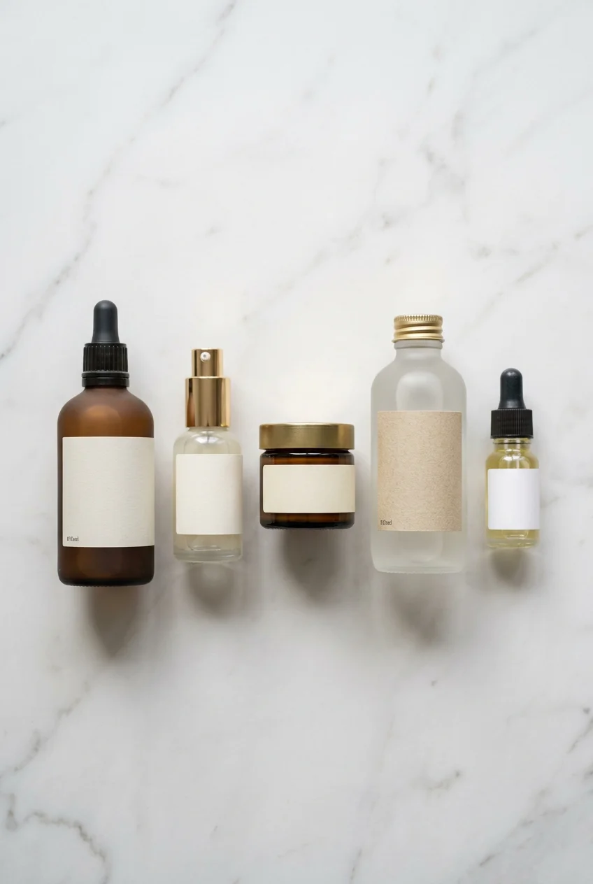
What’s Inside
- Master Regulatory Font Sizes in Your Skincare Label Design
- Use Strict INCI Rules for Every Single Ingredient
- Try Clear BOPP Materials for a Modern Look
- Add Tactile Textures to Upgrade the Unboxing Experience
- Stop Naming Your Product After Just One Ingredient
- Add QR Codes for Instant Digital Transparency
- Budget Properly for Professional Graphic Design
- Demand Waterproof and Oil-Resistant Materials
- Strip Back the Clutter with Minimalist Layouts
- Lock Down Your Net Contents on the Principal Display Panel
- Prove Your Sustainability Without Greenwashing
- Manipulate Mood with Smart Color Psychology
Last Tuesday at Target, I dropped a $28.99 bottle of Versed Dew Point Moisturizer (2 fl oz) right onto the hard linoleum floor because my hands were slick with a 1/2 teaspoon of tester lotion. As I scrambled to wipe the sticky, eucalyptus-scented mess off the green plastic, I noticed the back label had completely smudged off. That’s when I learned that proper skincare labeling is a survival skill. You can’t just slap a cute sticker on a bottle and expect it to hold up in a humid bathroom. I’ve spent four years analyzing packaging and ingredients for freshfaceroutine.com, and I’ve seen brands ruin expensive formulas because their labels peeled off in three days. It’s heartbreaking. A bad label doesn’t just look cheap; it kills consumer trust. If I can’t read your ingredient list, I’m not putting your product on my face. Period. Let’s talk about the disasters I’ve seen in the beauty aisles, the FDA rules most indie brands ignore, and how to fix your packaging before you launch. It took me years to figure out, but it’s worth the work.
1. Master Regulatory Font Sizes in Your Skincare Label Design

I learned this the hard way in 2022 while consulting for a small indie brand. We printed 500 units of a $34.00 rosehip night oil (1 oz) and had to trash every one of them. Why? The warning text on the back was only 3 points. The FDA doesn’t play games with font sizes. For general text on cosmetic labels, you need a minimum of 1/16 inch, which is about 5 points. If you’re working with tiny packaging under 12 square inches, like a 0.5 oz eye cream jar, you can drop the general text to 1/32 inch. But warning statements? Never smaller than 4.5 points. I was standing in Whole Foods last month, squinting at a $19.99 Acure Brightening Facial Scrub (4 fl oz), and noticed how they balanced the required 4.5-point net quantity declaration without ruining the design. It’s a common mistake to shrink text to fit a minimal aesthetic. Don’t do it. A gorgeous label won’t save you if the FDA pulls your product. I always print a 100% scale test sheet at home first. If I can’t read the 4.5-point text from a foot away without my glasses, it’s getting redesigned.
2. Use Strict INCI Rules for Every Single Ingredient

You’re probably tempted to list “Shea Butter” instead of “Butyrospermum Parkii.” I get it. It sounds friendlier. But prioritizing International Nomenclature of Cosmetic Ingredients (INCI) names is non-negotiable. I was at Sprouts three weeks ago and picked up a $14.99 generic body lotion (8 oz). The back label just said “Water, Coconut Oil, and Vitamin E.” I put it right back. That’s a red flag. You must list ingredients in descending order of weight. If you’re adding exactly 2 tablespoons of glycerin to a 16 oz batch of toner, it needs to be placed correctly in the list. The only exception is ingredients at concentrations under 1%. I’ve seen so many Etsy sellers get this wrong by putting a 0.5% active botanical at the top because it sounds fancy. That’s illegal misbranding. When I look at a $42.00 bottle of Paula’s Choice 2% BHA Liquid Exfoliant (4 fl oz), the INCI list is clinical and flawless. It builds trust. If you hide behind common names, it makes me think you’re hiding a filler-heavy formula.
3. Try Clear BOPP Materials for a Modern Look

There’s something satisfying about text that looks like it’s floating on glass. This “no-label look” is a huge trend for 2026, and you get it using clear BOPP (Biaxially Oriented Polypropylene). I swear by this material for oil-based serums. Last winter, I bought a $68.00 bottle of Wild Source Miracle Oil (1 fl oz) because the clear label let the golden-orange oil shine through. It felt raw and authentic. Clear BOPP is a super-thin, durable film. When applied to a smooth glass dropper, the edges disappear. But here’s the catch: if you try to apply a 2-inch clear label by hand, you’ll get infuriating air bubbles. I ruined ten labels on a DIY batch of 4 oz toner because microscopic dust got trapped underneath. It looked like the bottle had a skin disease. If you go the clear route, get a squeegee tool or a professional applicator. When done right, it makes a $2.00 amber glass bottle look like a luxury item.

Cetaphil Vitamin C Serum
If you want something that just works, Cetaphil Vitamin C Serum is a safe bet (923 reviews, 4.5 stars).
4. Add Tactile Textures to Upgrade the Unboxing Experience

We don’t just look at products; we hold them. A label that feels interesting changes how you perceive the formula. I realized this at Walmart last Friday while grabbing a $16.98 jar of Bubble Slam Dunk Hydrating Moisturizer (1.7 fl oz). The brand uses raised, rubbery letters. It feels grippy and fun. Adding tactile elements—embossed textures, soft-touch matte finishes, or raised foil—creates a sensory experience customers remember. It makes the product feel expensive before they open the lid. I once bought an $85.00 Tata Harper Resurfacing Mask (1 oz) and spent five minutes running my thumb over the gold-stamped lettering on the heavy glass. It felt cold, heavy, and luxurious. Most indie brands make the mistake of printing flat, glossy paper labels that feel like stickers from a dollar store. Skip the high-gloss paper. It feels sticky when your hands are wet. Ask your printer for a soft-touch laminate. It adds maybe $0.15 per label, but it makes a standard 2 oz tube feel like velvet. You might also like: 20 Creative Aesthetic Korean Skincare Worth Trying This Year
5. Stop Naming Your Product After Just One Ingredient

This is a major pet peeve and it’s against FDA guidelines. You can’t slap “100% Vitamin C Serum” on a label if the bottle also contains water, glycerin, and preservatives. The FDA considers this misbranding because it implies the entire 1 oz bottle is pure ascorbic acid. I see this constantly on Amazon, and I caught it at a farmer’s market recently. A vendor was selling a $22.00 “Pure Lavender Salve” (2 oz). I checked the back, and the first ingredient was 1/2 cup of cheap soybean oil. I felt lied to. Instead of naming the product after the hero, highlight it separately. Look at Naturium. Their $20.00 Vitamin C Complex Serum (1 fl oz) clearly states it’s a “complex” and lists supporting ingredients on the front. Keep the name accurate. You can add a sub-heading like “formulated with 5% Niacinamide” to draw attention to actives without misleading anyone. Transparency is everything. If I feel tricked by the front, I’m not reading the back. You might also like: 20 Clever Aesthetic Blue Skincare That Actually Work
6. Add QR Codes for Instant Digital Transparency

You’re running out of space on a tiny 0.5 oz eye cream jar. It happens. This is where digital integration saves your design. Putting a scannable QR code on your label is a huge trend for 2026, and I’m obsessed. I was in Target a few weeks ago, staring at a $19.99 bottle of Cocokind Ceramide Barrier Serum (1 fl oz). They had a tiny, crisp QR code on the side. I scanned it, and it pulled up a 60-second video on how to layer it, plus their carbon footprint stats. It was brilliant. You don’t need to cram a 500-word story onto a 2×2 inch sticker. Let the QR code do the work. I’ve even seen luxury brands using NFC chips where you tap your phone to the bottle. But honestly, a free QR generator works fine. Just make sure the code is at least 0.4 inches square. I once tried to scan a micro-QR on a $12.00 lip balm (0.15 oz) and my camera couldn’t focus at all. Test it with three different phones before you print a thousand copies. You might also like: 15 Lovely Aesthetic Luxury Skincare to Inspire Your Next Project

Vtopmart 3 Tier Clear Makeup Organizer with Drawer
A dependable everyday pick — Vtopmart 3 Tier Clear Makeup Organizer with Drawer pulls in 2 ratings at 4.5 stars. Not flashy, just solid.
7. Budget Properly for Professional Graphic Design

I’m going to be honest: I can tell when you designed your label on Canva using a free template. It looks flat, the margins are off, and the fonts fight each other. If you want to charge $45.00 for a 1.7 oz face cream, the outside needs to look as expensive as the formula inside. While you can buy templates on Etsy for $3 to $27, professional design is crucial for long-term success. A good designer knows how to balance negative space, kerning, and typography. Custom labels from freelancers usually start around $50 to $150. A full agency branding package is $500 to $2500+. I hired a cheap designer once for a batch of 8 oz coffee scrubs. I paid $15 on Fiverr. The designer used a font so thin the letters bled together into unreadable smudges. I had to throw away $60 worth of waterproof paper. Spend the money upfront. Look at a $38.00 bottle of Sunday Riley Good Genes (0.5 fl oz). The typography is crisp and confident. That’s what you’re competing with.
8. Demand Waterproof and Oil-Resistant Materials

Skincare lives in the harshest environment in your house. The bathroom is a hot, wet nightmare for paper. If you use cheap paper labels, they’ll peel and disintegrate in a week. I bought a beautifully packaged $24.00 cleansing oil (4 fl oz) in Austin last year. It smelled amazing. But after three days in my shower, the paper label absorbed the oil dripping down the glass. The ink ran, and the label turned into a sticky, gray blob. It left a nasty adhesive smear on my shower tile that took ten minutes to scrub off. It was disgusting. You must select waterproof materials like BOPP or flexible vinyl. Vinyl is incredibly forgiving and works well on squeezable plastic. If you put a rigid paper label on a 6 oz flexible face wash tube, the label will crease the second you squeeze it. Check the aisles at Kroger. You’ll notice smart brands like CeraVe use flexible, plastic-based labels on their $15.49 Hydrating Facial Cleanser (12 fl oz). It survives steamy showers and oily fingers without peeling at the corners.
9. Strip Back the Clutter with Minimalist Layouts

We are overwhelmed by visual noise. When a label screams at me with five neon colors, three cursive fonts, and a massive list of buzzwords, my brain shuts down. Minimalist design dominates in 2026 because it conveys clarity and science. The king of this is The Ordinary. I have a $9.00 bottle of their Niacinamide 10% + Zinc 1% (1 fl oz) on my vanity. It’s just crisp black text on a white background. A thin line separates the name from the volume. It feels clinical and deeply trustworthy. You don’t need a watercolor painting of a garden to prove you have plant extracts. I tried designing a complex, floral label for a homemade 2 oz rosewater mist a few years ago. It looked like a cheap perfume from the 90s. I scrapped it, switched to a plain white waterproof sticker with a black serif font, and it looked like a $40 apothecary brand. Focus on essential information. Let the white space breathe. It makes the customer feel like they’re buying a serious treatment, not a gimmick.
Clear Stackable Makeup Organizer with Drawer
A dependable everyday pick — Clear Stackable Makeup Organizer with Drawer pulls in 306 ratings at 4.5 stars. Not flashy, just solid.
10. Lock Down Your Net Contents on the Principal Display Panel

The Principal Display Panel (PDP) is what the consumer sees first on the shelf. The FDA has strict, unbreakable rules about what goes there. You can’t hide the net contents on the back near the barcode. The exact quantity (like 4 fl oz / 118 mL) must be prominently displayed on the bottom 30% of the PDP. I was at Costco recently, looking at a $32.99 tub of Nutrium Body Butter (13.5 oz). Even on a container that huge, the weight was boldly printed exactly where it needed to be. A common mistake I see with indie brands is writing “approximately 2 oz” because they hand-pour in small batches. You can’t do that. It has to be an exact net weight or volume, excluding the weight of the glass jar itself. And you must include both US and metric units. I once bought a $16.00 handmade clay mask that just said “Small Jar” on the front. I had to weigh it on my kitchen scale to figure out I only got 1.2 oz. It felt deceptive. Be clear about exactly how much product the customer is paying for.
11. Prove Your Sustainability Without Greenwashing

Consumers are skeptical of fake eco-friendly claims. Slapping a green leaf icon on your bottle doesn’t cut it anymore. If you highlight sustainability, be specific and authentic. I’m obsessed with how Cocokind handles this. On their $19.99 Texture Smoothing Cream (1.7 oz), they print “sustainability stats” on the box, detailing the carbon footprint of their process. They use easily removable labels so you can recycle the jar without fighting sticky residue. Another example is Raw Elements. I use their $18.99 Tinted Facial Sunscreen (1.8 oz) in the recyclable aluminum tin. They use raw, unbleached paper for packaging. It feels earthy, which matches their reef-safe message. But here is the catch: don’t use the “Leaping Bunny” cruelty-free logo unless you’ve actually paid for the certification. I caught a brand doing this on Instagram last year, and they got dragged in the comments. If your formula uses 1/4 cup of ethically sourced shea butter, mention the specific sourcing on the side. Just be honest. Greenwashing will destroy your reputation faster than a bad formula.
12. Manipulate Mood with Smart Color Psychology

Color is a silent salesperson. It triggers an emotional response before the customer reads a word. I was in Trader Joe’s last week and impulsively threw their $8.99 Daily Facial Sunscreen (1.7 fl oz) into my cart. Why? The packaging is a soft, muted peach. It looked calming and safe. Pastel colors like soft blues and sage greens evoke serenity, which is what you want for sensitive skin. On the flip side, black represents luxury and efficacy. Think about the sleek, dark packaging of a $225.00 La Mer serum (1 fl oz). It commands respect. I recently analyzed a Swedish brand called Lernberger Stafsing. Their $45.00 SOS Barrier Repair Cream (1.7 oz) uses a stunning bronze and beige palette. It exudes quiet, confident elegance. A mistake I made early on was using a neon yellow label for a soothing chamomile night cream. It made no sense. The color screamed “energy drink” while the product was meant to put you to sleep. Always match the label’s color to the goal of the formula. If it’s a cooling 4 oz aloe gel, use a frosty, translucent blue. It’s basic psychology, but it works every time.
Designing the perfect label isn’t just about making something pretty for your Instagram feed. It’s about protecting your formula, following federal laws, and building genuine trust with the person holding that bottle. I swear by printing a dozen test layouts on cheap paper and taping them to empty bottles before committing to a print run. It saves money, time, and heartbreak. Honestly, learning these rules changed how I view every product I buy. Next time you’re walking down the beauty aisle, take a closer look at the bottles you’re drawn to. You’ll start noticing the fonts, the waterproof BOPP materials, and the smart QR placements. If you’re working on your own product, don’t rush this. Pin this guide to your mood board, save it for your next design meeting, and make sure your outside matches the quality of your inside.
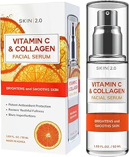
Skin 2.0 Vitamin C Serum – Dermatologist Tested
Skin 2.0 Vitamin C Serum – Dermatologist Tested punches above its price — 45 buyers rated it 4.5 stars. I would buy it again.
Frequently Asked Questions
What is the best material for skincare labels?
I highly recommend waterproof and oil-resistant materials like clear BOPP or flexible vinyl. Standard paper labels will peel, curl, and smudge in humid bathroom environments.
How small can the font be on a cosmetic label?
The FDA requires a minimum font size of 1/16 inch for general text. Warning statements can’t be smaller than 4.5 points. Always test print your designs to ensure readability.
What is the principal display panel in skincare packaging?
It’s the front-facing part of your product label that consumers see first on the retail shelf. You must prominently display your exact net weight on the bottom 30% of this panel.
How much does professional skincare label design cost?
If you skip cheap templates, a professional freelance designer usually charges around $50 to $150 per label. Full branding packages from agencies can cost over $2000. It’s completely worth the investment.
