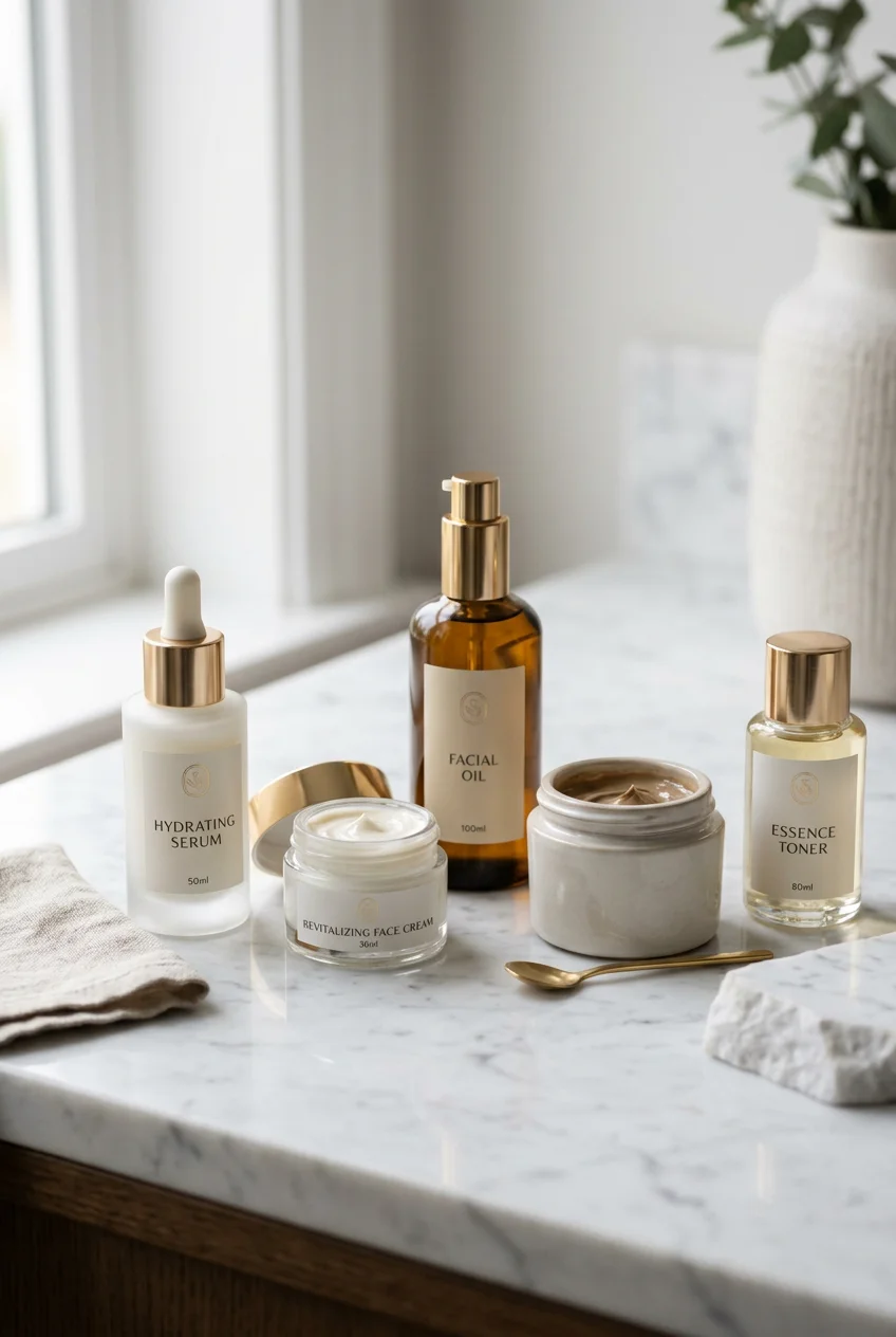
What’s Inside
- Embrace Emotional Minimalism With Nature-Inspired Tones
- Prioritize Tactile Experiences With Matte Finishes
- Design For Circularity With Refillable Systems
- Leverage Smart Luxury With Airless Pumps
- Ensure Label Legibility And Waterproof Durability
- Embrace Cloud Dancer White For A Clean Skincare Product Aesthetic
- Utilize Color Psychology Strategically
- Incorporate Multi-Sensory Unboxing Packaging
- Avoid Overly Complex Minimalist Designs
- Use Transparent Packaging To Build Trust
- Implement Digital Integration For Transparency
- Consider Unique Shapes And Sizes For Differentiation
- Match Label Color With The Cosmetic Inside
- Prioritize Ergonomics For A Functional Skincare Product Aesthetic
I stood in the middle of Target last Tuesday, staring at a leaked 2 oz bottle of an $18.99 vitamin C serum that ruined the inside of my leather purse. That sticky, orange, metallic-smelling mess made me realize a good skincare aesthetic isn’t just about looking pretty on a shelf. It’s about how the bottle functions, feels, and survives daily life. If you’re building a routine or a brand, the skincare aesthetic dictates whether you actually use the formula or toss it in frustration. I’ve spent three years testing formulas for freshfaceroutine.com. I’ve learned the hard way that cheap plastic pumps, peeling labels, and slippery glass bottles ruin perfectly good formulas. Let’s break down 14 ways packaging design matters, step by step. We’ll look at the materials you should look for, the hidden costs of bad pumps, and why certain colors trick your brain into trusting a product. Stop buying things just because they look cute on Instagram. Function is the foundation of true aesthetic appeal.
1. Embrace Emotional Minimalism With Nature-Inspired Tones

When I started reviewing products, I bought neon pink and bright yellow bottles because they stood out. Big mistake. Loud colors look cheap in person and clash with everything in a bathroom. Right now, emotional minimalism is taking over. Think soft neutrals, warm beiges, and muted mauves. I bought the 1 oz Naturium Niacinamide Serum for $16.00 at Target last month because the heavy, frosted beige glass feels calming. It doesn’t scream for attention. Brands are finally realizing that a proper skincare aesthetic should feel like a quiet spa, not a chaotic toy store. A subtle gold accent on a pastel cap looks intentional. I tried a generic 2 oz, $5.99 moisturizer from Walmart last year that used bright teal plastic. The formula was fine, but the bottle looked so jarring on my vanity that I hid it in a drawer. Out of sight, out of mind. I stopped using it within a week. If you’re designing a line or curating your shelf, stick to nature-inspired tones. They communicate authenticity. Plus, a muted sage or soft beige bottle photographs beautifully if you’re sharing your routine online.
2. Prioritize Tactile Experiences With Matte Finishes

How a bottle feels in your hand matters as much as how it looks on a screen. Glossy, cheap plastic slips out of wet hands. I learned that the hard way. I dropped a 4 oz, $42.00 glass bottle of Youth To The People toner on my tile floor because the smooth glass offered zero grip when my hands were damp. It shattered. Now, I look for matte and soft-touch finishes. They communicate elegance while acting as a non-slip surface. Some brands use recycled resin mixed with sand or stone textures to create a natural, gritty grip. I picked up a 4 oz bottle of Cocokind’s Rosewater Toner for $19.49 at Whole Foods, and the textured label made it so much easier to hold during my messy morning routine. Embossed logos are also replacing cheap ink. Standard ink scratches off after two weeks in a makeup bag. An embossed logo stays put. The tactile experience builds a subconscious connection. When a bottle feels heavy and textured, your brain registers it as high quality. Smooth, thin plastic just feels like a disposable water bottle.
3. Design For Circularity With Refillable Systems

Throwing away a heavy glass pump bottle every six weeks is wasteful. Sustainability isn’t just a buzzword. It’s a structural requirement. Refillable systems are finally getting good. I’m not talking about flimsy, messy refill pouches that tear. I mean premium, modular bottles designed for years of use. I bought the 5 oz Fenty Skin Fat Water Toner Serum for $34.00 at Sephora, and the twist-to-open mechanism means there isn’t a separate cap to lose down the drain. For true refills, look at the British brand Daisyface. They use a gorgeous, heavy 50ml sage-green shell for their cleansers. You keep the durable outer shell on your vanity and just pop in a lightweight, recyclable inner cartridge when you run out. The cartridges usually cost $5 to $10 less than the full product, saving you money. I tried a cheap refillable moisturizer from Kroger for $12.99 last winter, but the inner pod kept getting stuck and eventually cracked. The mechanism needs to be smooth. When done right, a refillable system makes you feel like you’re making a smart investment rather than buying another plastic tub. You might also like: 11 Luxury Skincare Packaging for Every Budget

Clear Acrylic Makeup Organizers for Vanity,Countertop
Clear Acrylic Makeup Organizers for Vanity has been one of the most consistently praised picks in this category. 208 reviewers averaged 4.5/5.
4. Leverage Smart Luxury With Airless Pumps

Smart luxury means the packaging protects the delicate formula. Dropper bottles look like vintage apothecary jars, but they expose active ingredients to air, light, and bacteria every time you open them. I used a 1 oz, $28.00 vitamin C serum in a clear dropper bottle from Sprouts last year, and it oxidized into a brown, useless liquid within three weeks. That’s money down the drain. Airless pump bottles are the only way to go for active ingredients. They usually come in 15ml, 30ml, and 50ml sizes. A good airless pump pushes a disc up from the bottom, so you get every last drop without exposing the serum to oxygen. I use the 1.7 oz Bubble Skincare Slam Dunk Hydrating Moisturizer. It’s $15.98 at Walmart. You press the top down, and a dime-sized amount of cream pops up in a cute flower shape. It’s sanitary. Good packaging is easy to use with one hand. If you have to unscrew a lid, set it down, scoop out cream with dirty fingers, and screw it back on with slippery hands, the design has failed. You might also like: 12 Skincare For Oily Skin Worth Trying
5. Ensure Label Legibility And Waterproof Durability

I can’t stand when a brand uses a tiny, pale gray font on a white background. I shouldn’t need reading glasses in the shower to figure out if I’m holding a face wash or a body lotion. Skincare labels must feature readable fonts. They also need to be waterproof and oil-resistant. I bought a 2 oz jar of a local face balm for $22.00 at a farmer’s market last July. Within a week, the oils from my fingers dissolved the ink on the paper label. It turned into a sticky, gray smudge. Brands need to state the name, like “Hydrating Face Serum,” clearly on the front. Key selling points should be obvious. I appreciate the 4 oz Good Molecules Niacinamide Brightening Toner. It costs $14.00 at Target. The label is a synthetic, waterproof material that won’t peel, and the ingredients are printed in stark black text. The packaging stays pristine even after sitting in a steamy shower. Durability is a massive part of the overall appeal.
6. Embrace Cloud Dancer White For A Clean Skincare Product Aesthetic

There’s a specific shade of white that makes a product look expensive. It’s not a harsh, blinding hospital white. Pantone calls it “Cloud Dancer.” It’s a soft, neutral white that conveys sophistication. This shade will dominate the skincare aesthetic over the next few years. I recently picked up a 5.9 oz tube of Byoma Creamy Jelly Cleanser for $11.99 at Target. While Byoma uses bright colors for their serums, their neutral, soft-toned bottles look refined and mature. When you pair a soft white with frosted glass or a matte coating, it creates a crisp, modern impression. I used to buy products in clear plastic, but they look gross as the product empties and sticks to the sides. A solid, Cloud Dancer white bottle hides the messy reality of a half-empty product. It keeps your vanity looking organized. Just avoid cheap, glossy white plastic. It scratches easily, attracts dust, and looks like a generic hotel lotion bottle you stole on vacation. No exaggeration. You might also like: 14 Skincare Products Photography You Need to See

Vtopmart 3 Tier Clear Makeup Organizer with Drawer
If you want something that just works, Vtopmart 3 Tier Clear Makeup Organizer with Drawer is a safe bet (2 reviews, 4.5 stars).
7. Utilize Color Psychology Strategically

Color dictates what you expect a product to do before you read the label. Green signifies organic ingredients. Black screams high-end luxury or repair. If I see a matcha green bottle, I assume it’s a calming treatment. I bought the 1 oz Cocokind Ceramide Barrier Serum for $21.99 at Whole Foods. The glass dropper is a deep, earthy green. My brain trusts it to calm my skin. I tried a 2 oz lavender sleep mask from a drugstore brand that came in a neon orange jar. The disconnect between the energetic orange color and the relaxing lavender scent was jarring. I returned it because I couldn’t stand looking at it before bed. If you’re building a brand, match the color to the function. Sage shades work with transparent glass to reinforce environmental values. Black glass blocks UV light, which is why brands use it for unstable retinols. It’s not just about looking chic. The color protects the formula and sets the psychological expectation.
8. Incorporate Multi-Sensory Unboxing Packaging

The unboxing experience sets the tone. If a serum comes in a flimsy cardboard box that rips, you assume the formula inside is cheap. Multi-sensory packaging changes that perception. I ordered a 1.7 oz jar of Tatcha The Dewy Skin Cream online. It retails for $72.00, but the unboxing justifies the price. The box uses thick, textured paper. The logo is debossed, so you can feel the indentation under your thumb. When you slide the box open, there’s a satisfying friction. Compare that to a 3 oz, $9.99 moisturizer I grabbed at Costco. It was sealed in a hard plastic clamshell that required heavy-duty scissors to open, and I cut my thumb prying it apart. That is a terrible experience. Brands should use soft-touch lamination or spot UV highlights on custom boxes. Spot UV creates a raised, glossy texture on specific parts of a matte box. It catches the light and makes your fingers linger on the packaging.
9. Avoid Overly Complex Minimalist Designs

There’s a fine line between informative and chaotic. A mistake I see constantly is packaging covered in tiny paragraphs, five fonts, and metallic graphics. It overwhelms the eye. A pared-back routine requires pared-back packaging. Minimalist design with clean lines and clear typography conveys simplicity. I bought an 8 oz bottle of Vanicream Gentle Facial Cleanser for $8.99 at Walmart. The packaging is basic. It’s stark white with a blue pump and plain black text. It’s not winning art awards, but it communicates that it won’t irritate my skin. I tried a 1 oz trendy indie brand serum from an Instagram ad that cost $35.00. The bottle had holographic foil, a cursive font that was impossible to read, and three logos competing for space. It looked like a teenager’s scrapbook. I couldn’t even figure out if I was supposed to use it morning or night. Let the product’s essence shine. If the formula is good, you don’t need holographic foil to trick people. Keep the typography legible.

6Pcs Jade Roller for Face
If you want something that just works, 6Pcs Jade Roller for Face is a safe bet (29 reviews, 4.5 stars).
10. Use Transparent Packaging To Build Trust

Sometimes the best design choice is getting out of the way. Clear containers let you see exactly what you’re putting on your face. This works for thick gels, golden oils, or anything with a unique texture. The Ordinary mastered this. They use monochromatic labels on recyclable clear glass. You can see the exact color and viscosity before you buy it. I buy their 1 oz Niacinamide 10% + Zinc 1% for $6.00 at Target. The transparency builds trust. You know there aren’t weird dyes hiding inside. I bought an opaque, white 6 oz bottle of a generic salicylic acid wash from Kroger for $7.49. When I pumped it out, the liquid was a startling, artificial neon blue. If the bottle had been transparent, I never would have bought it. Transparency forces a brand to formulate without ugly colorants. Just remember that clear glass doesn’t block UV light. You can’t put unstable ingredients like pure vitamin C in a clear bottle, or it degrades in days.
11. Implement Digital Integration For Transparency

Packaging space is limited. You can’t fit a full ingredient sourcing map on a 1 oz bottle. This is where digital integration solves the problem. Brands are putting small QR codes or NFC tags on the back of their labels. I scanned a QR code on a 1 oz, $24.00 bottle of Cocokind’s Ceramide Serum last Tuesday. It pulled up a webpage showing exactly where they sourced the lactic acid, detailed recycling instructions for the glass bottle, and a 15-second video showing how much to apply. It was brilliant. I tried a different 4 oz toner from Sprouts for $14.99 that had an NFC tag, but it just linked to their generic homepage. That’s a wasted opportunity. If you include a QR code, it must lead to useful information. Consumers want to know if the packaging is actually recyclable. A tiny code keeps the front label looking clean while giving ingredient nerds the data they want. It bridges the gap between aesthetic simplicity and deep transparency.
12. Consider Unique Shapes And Sizes For Differentiation

Walk down the beauty aisle, and you’ll see a sea of identical cylinders. The physical shape of your packaging is the fastest way to stand out. A bottle that fits perfectly in your palm feels custom-made. I bought the 5 oz Glow Recipe Watermelon Glow PHA+BHA Pore-Tight Toner for $34.00 at Sephora. The heavy glass bottle is shaped like a curved, melting watermelon. It’s unique and feels secure when I hold it. I once bought a 1.7 oz square moisturizer jar from a boutique for $45.00. The sharp plastic corners dug into my palm when I tried to unscrew the lid. It was an ergonomic nightmare. I’ve also seen brands experimenting with multi-functional packaging. Some serums come in a box that turns into a tray for your vanity. If you change the silhouette of the bottle, you don’t need loud colors or crazy fonts. A smooth, teardrop-shaped glass bottle in a muted tone will grab my attention much faster than a standard cylinder with a bright pink label.

COSRX Vitamin E Vitalizing Sunscreen,SPF 50 Face Sunscreen
Honestly, COSRX Vitamin E Vitalizing Sunscreen surprised me — sturdier than it looks in the photos, and over 43 buyers gave it 4.5 stars.
13. Match Label Color With The Cosmetic Inside

Creating visual cohesion between the label and the liquid inside is a brilliant trick. It communicates the product’s look before you unscrew the cap. If a facial oil has a rich, natural amber hue, an amber-toned label makes the whole package look intentional. I use the Sunday Riley C.E.O. Glow Vitamin C and Turmeric Face Oil. I bought the 0.5 oz bottle for $40.00 at Ulta. The oil is a vibrant orange-yellow, and the label features a matching sunny gradient. It feels unified. I bought a cheap 1 oz, $8.99 rosehip oil from Walmart that had a cool-toned blue label. When I dropped the warm, orange oil into my hand, the contrast felt jarring. It felt like the label was designed for a different product. Matching the tones reinforces brand recognition. When the outside matches the inside, the product feels honest. It’s a small detail, but it turns a basic glass dropper into something that looks like it belongs in a high-end spa.
14. Prioritize Ergonomics For A Functional Skincare Product Aesthetic

All the beautiful design in the world won’t save a product that’s annoying to use. Ergonomics make or break a routine. The neck size of a bottle dictates how easily the product flows. I bought a thick, heavy 8 oz lotion from Whole Foods for $16.99 that came in a rigid bottle with a tiny neck. I had to shake the bottle upside down to get anything out. My wrist actually hurt. Thick creams require wide-mouth jars or heavy-duty pumps. Lightweight, watery toners need a small restrictor cap so you don’t pour half the bottle into your palm by accident. I bought a 4 oz rose water toner from Trader Joe’s for $3.99, and it has a perfect spray nozzle. I use the 12 oz CeraVe Hydrating Facial Cleanser, which costs $14.99 at Target. The pump has a wide, flat top. I can easily press it down with the heel of my hand when my fingers are covered in makeup remover. That’s perfect ergonomics. Secure screw caps are also vital. A cap that cross-threads will leak in your travel bag.
Packaging is never just packaging. It’s the delivery system for the ingredients you’re paying for. If I had to pick one rule to live by, it’s avoiding cheap dropper bottles for active ingredients. Stick to airless pumps like the Bubble moisturizer I mentioned earlier. It saves your formula and your money. Next time you’re browsing the aisles at Target or Whole Foods, pay attention to how a bottle feels in your hand before you look at the price tag. You’ll start noticing these design tricks everywhere. Pin this guide to your skincare board so you can reference these packaging red flags before your next haul. Let’s stop wasting money on bad bottles and start demanding packaging that works.
Frequently Asked Questions
What makes a skincare product aesthetic look expensive?
A premium aesthetic relies on heavy materials like frosted glass, minimalist typography, and muted, nature-inspired tones. Matte finishes and embossed logos also trick the brain into perceiving higher value, whereas glossy, brightly colored plastic usually looks cheap and disposable.
Why are brands switching to airless pump bottles?
Airless pumps protect sensitive ingredients like vitamin C and retinol from oxygen and bacteria. Unlike dropper bottles, which expose the formula to air every single time you open them, an airless pump pushes the product up from the bottom, keeping it completely sanitary.
How does packaging color affect consumer trust?
Color psychology plays a massive role in skincare. Green and sage tones communicate organic, soothing ingredients, while black glass signifies luxury and protects UV-sensitive formulas. Transparent bottles build trust by letting you see the exact color and texture of the formula inside.
Are refillable skincare packages actually sustainable?
Yes, but only if the mechanism is durable. The best refillable systems use a heavy glass or metal outer shell that you keep forever, paired with lightweight, recyclable inner plastic pods. Flimsy refill pouches often leak and aren’t accepted by municipal recycling programs.
