What’s Inside
- Embrace “Skinimalism” in Skincare Social Media Design
- Show the Exact Amount of Product (No More Guessing)
- Authentic Before and After Photos Without the Ring Light
- Micro-Influencers Sharing Real Morning Routines
- Breaking Down Trending Ingredients with Infographics
- Capturing the Perfect Texture Shot
- Debunking Myths with Visual Comparisons
- Frictionless Social Commerce for Easy Shopping
- Visual Calendars for Skin Cycling Routines
I spent $45 on a vitamin C serum last Tuesday at Whole Foods because the Instagram ad looked incredibly aesthetic. But when I opened the 1 oz dropper bottle at home, it smelled exactly like expired hot dog water. That’s the exact moment I realized how deceiving skincare social media design can be if you aren’t paying close attention. I’m a skincare product researcher. I spend my days analyzing what actually works versus what just looks pretty on a tiny phone screen. If you’re trying to figure out how to spot the real deals, or if you’re a brand trying to make content that doesn’t suck, we need to talk. I’ve fallen for the glossy filters and bought absolute garbage at Target just because the pastel packaging perfectly matched my bathroom tiles. It’s embarrassing. I learned that the hard way. Today I’m breaking down exactly what good, honest content looks like. We’re going to look at real products, exact prices, and the specific visual tricks that actually help you get glowing skin instead of an empty wallet.
1. Embrace “Skinimalism” in Skincare Social Media Design

I used to cram my bathroom cabinet with 15 different neon-colored bottles I bought on late-night Walmart runs. My skin was constantly red and peeling from ingredient overload. The biggest trend for 2026 is “skinimalism.” It’s heavily reflected in how smart brands style their photos. Good skincare social media design strips away the visual clutter. You won’t see a messy background filled with fake silk flowers anymore. Instead, you’ll see a clean, well-lit shot of a single hero product. I noticed this massive shift when I was scrolling TikTok last month and saw a wildly popular video for The Ordinary’s Niacinamide 10% + Zinc 1% serum. It costs exactly $6.60 for a 1 oz bottle. The video showed the clear glass dropper against a plain white background with simple black text explaining how niacinamide supports your skin barrier. No flashy transitions. No loud, obnoxious music. Just the facts. When I hold that frosted glass bottle, it feels heavy and substantial. The dropper clicks satisfyingly. The minimalist label with just the scientific name and percentage looks clinical and trustworthy. That’s the exact vibe you want for your feed. Skip the heavily filtered, busy backgrounds. They look like cheap late-night infomercials. When you’re looking at product posts, pay attention to the ones that focus on a single key active ingredient. If a post throws 12 different active ingredients in your face with crazy neon graphics, it’s usually a massive red flag. I fell for a chaotic ad for a 4 oz tub of “miracle cream” at Costco last year. It promised to fix everything from deep wrinkles to bad credit. It ended up giving me painful cystic acne on my chin. Simple visuals usually mean a focused, effective formula.
2. Show the Exact Amount of Product (No More Guessing)

I can’t tell you how many times I’ve watched an influencer dump half a bottle of expensive serum directly onto their cheeks just because it looks satisfying and drippy on camera. I actually tried doing that with a vitamin C serum I bought at Sprouts for $28.99. My face was sticky for three straight days, and I ruined a perfectly good silk pillowcase. The best accounts are finally stopping this nonsense and demonstrating correct product quantities with clear visual cues. Given the dominance of platforms like TikTok and Instagram Reels, you’ve got to prioritize short-form video content under 60 seconds. You don’t have time for a five-minute monologue. Use dynamic visuals and concise text overlays. I was watching a Reel on my phone screen while waiting in line at Whole Foods. The creator used bold, yellow text overlays to say “STOP DOING THIS” while showing herself wasting a massive palm-full of a $40 essence. Then she showed the correct “pea-sized” amount for Maelove’s Glow Maker Vitamin C Serum ($32.95 for 1 oz). The text was huge and readable even on a small screen. Good creators will show that tiny drop on their fingertip, not dripping dramatically down their forehead. The same goes for sunscreen. The “two finger-lengths” rule is everywhere now. I saw a brilliant carousel post yesterday that showed exactly two strips of sunscreen measuring 1/4 teaspoon total. It takes the guesswork completely out of the equation. I used to apply a tiny dot of SPF because I hated the greasy feeling, and I got a horrible sunburn on my nose during a hike. Seeing the actual physical amount squeezed out onto a hand in a photo helps you understand exactly what you’re supposed to do.
3. Authentic Before and After Photos Without the Ring Light

Nothing makes me roll my eyes harder than a “before” photo taken in a dark, dingy basement and an “after” photo taken under a $300 professional ring light with a beauty filter cranked to the max. I bought a terrible foaming acne wash at Kroger a few years ago because the before-and-after photos looked miraculous. In reality, the wash just dried out my skin so badly it cracked and bled. High-quality, unedited before-and-after photos are crucial for building real trust now. When you’re looking at results for a serious investment product, like Skinbetter Science AlphaRet Overnight Cream (which runs around $236 for 1 oz), you want to see consistent lighting and identical angles. Dermatologists always recommend this for aesthetic practices. The background should be the exact same. The facial expression should be neutral in both shots. I appreciate when an account shows the raw, textured skin in the “after” photo. Skin has pores. Skin has peach fuzz. If a photo shows someone looking like a blurred plastic mannequin, it’s fake. I recently saw a post from a small esthetician account showing a 12-week progression of hyperpigmentation fading. She used the exact same bathroom lighting by her window every single Tuesday at 9 AM. You could see the subtle changes without feeling manipulated. She even showed a close-up of a small acne scar on her chin that hadn’t completely faded, which made the whole post feel so much more authentic. If you’re a brand, don’t edit out every single flaw. It makes us suspicious. I once bought a dark spot corrector at Target for $19.99 because the model’s skin looked literally poreless. It was just a thick, chalky paste that smelled like bleach and did absolutely nothing for my sun spots. You might also like: 20 Creative Aesthetic Korean Skincare Worth Trying This Year
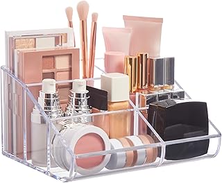
STORi Clear Plastic Vanity Makeup Organizer | 6-Compartment
If you want something that just works, STORi Clear Plastic Vanity Makeup Organizer | 6-Compartment Holder for is a safe bet (62 reviews, 4.5 stars).
4. Micro-Influencers Sharing Real Morning Routines

I’m completely blind to celebrity endorsements at this point. If an A-list actor tells me they get their glowing skin from a $9 drugstore face wash, I know they’re lying. They get their skin from a team of dermatologists and $500 laser treatments. In 2026, the real value is in micro-influencer partnerships. These are creators with maybe 2,000 to 10,000 followers who actually reply to their comments. Their content feels like a FaceTime call with a best friend. I follow a girl from Chicago who works a normal 9-to-5 job, and she posted a video showing her morning routine using Byoma’s Hydrating Serum. It costs $15.99 for 1.01 oz at Target. She didn’t have perfect lighting. Her hair was messy in a plastic claw clip. She just showed how the serum absorbed into her dry skin before she put on her makeup for work. It was so relatable that I bought it the next day. Brands that collaborate with these smaller creators get much better engagement. They also encourage User-Generated Content with branded hashtags. It builds so much authenticity. I remember when Glossier ran their big hashtag campaigns. You’d see thousands of real people with diverse skin types sharing their raw, unfiltered results. I tried copying a massive mega-influencer’s 14-step glass skin routine I saw on Instagram. I spent almost $200 at Target on various essences and ampoules. My face broke out in tiny red bumps because it was way too much product for my sensitive barrier. Micro-influencers tend to share practical, community-driven approaches that won’t destroy your skin. When they use a branded hashtag to show how a simple $15 serum cleared their dry patches, I believe them. It feels like a recommendation from a sister, not a billboard. You might also like: 20 Stunning Tips Natural Skincare That Actually Work
5. Breaking Down Trending Ingredients with Infographics

I’m a total nerd for ingredients, but I know reading a label can feel like trying to decipher ancient Greek. Consumers are incredibly ingredient-conscious right now. The best accounts are designing educational content around trending ingredients using clean infographics or short, punchy videos. For example, Ectoin is a huge ingredient right now. It’s known for its intense protective and hydrating properties. I saw a brilliant graphic last week that visually broke down how Ectoin binds to water molecules to form a protective shell around skin cells. It used little blue water droplet animations. It made total sense. Good educational design respects your intelligence and helps you make informed choices. I saw another fantastic infographic explaining Postbiotics. It used a simple pie chart to show the difference between prebiotics, probiotics, and postbiotics, using a garden analogy. Prebiotics are the fertilizer, probiotics are the seeds, and postbiotics are the actual bloomed flowers. It was so clever and easy to grasp. I used to buy products just because they said “anti-aging” on the front in sparkly gold letters. I picked up a moisturizer at Walmart for $14.50 that promised to erase fine lines in three days. When I finally learned how to read the back label, I realized the main ingredient was just plain mineral oil and water. Now, I look for posts that actually explain what an ingredient does and what percentage is used in the formula. If a post just slaps the word “Peptides” on a pink background without explaining which specific peptides are used or how they stimulate collagen production in the dermis, I scroll past. You might also like: 20 Gorgeous Aesthetic Products Korean Skincare for Every Budget
6. Capturing the Perfect Texture Shot

Skincare is an incredibly tactile experience. If a moisturizer feels like wet cement, I’m not going to use it, no matter how good the ingredients are. That’s why texture shots are my absolute favorite type of visual content. Designing captivating texture shots of products like a rich night cream or a bouncy gel cleanser engages your senses before you even touch the product. Good creators use macro photography to highlight the exact consistency. I remember seeing a stunning close-up video of Cocokind’s Oil to Milk Cleanser. It costs $18.99 for a 2.9 oz tube. The video showed a thick, golden oil being massaged into the skin, and then the exact moment a few drops of water were added, it instantly turned into a milky, creamy wash. You could practically feel the slip of the product through the screen. I bought it immediately at Target. This is especially true now that “Beyond the Face” skincare is trending. Consumers expect body products to perform exactly like facial skincare. I’m seeing gorgeous texture shots of body lotions packed with AHAs, niacinamide, and ceramides designed for the neck and chest. Contrast that with a terrible purchase I made at Trader Joe’s. I bought a generic body butter for $5.99 because the tub looked cute on the shelf. I couldn’t see the texture before buying. When I opened it at home, it was so incredibly stiff I had to dig it out with a spoon, and it left greasy white streaks all over my legs. It smelled heavily of artificial vanilla, which gave me a headache. A good macro shot of a product smeared on a glass plate or swiped across the back of a hand tells you exactly what you’re getting into.

Yeamon Gua Sha Facial Tools and Face Roller Set
A dependable everyday pick — Yeamon Gua Sha Facial Tools and Face Roller Set pulls in 1 ratings at 4.5 stars. Not flashy, just solid.
7. Debunking Myths with Visual Comparisons

There is so much terrible advice floating around on the internet. I once followed a viral hack that told me to rub raw lemon juice and baking soda on my nose blackheads. I ended up with a literal chemical burn that took two weeks to heal. Directly tackling prevalent misinformation is a huge part of good content strategy right now. I love seeing visually engaging “Myth vs. Fact” posts. A recent study showed that 60% of TikTok creators actually show themselves pulling on their skin too harshly during application. You’ll see them dragging their palms down their cheeks to rub in a lotion. A great post will show a split screen. On the left side, a big red “X” over someone aggressively dragging their skin. On the right side, a green checkmark showing someone gently patting and pressing a serum in with their fingertips. Another common mistake is the incorrect layering of products, which 54% of creators get wrong. I saw a super helpful infographic that laid out the exact order: water-based serums first, then thicker creams, then oils. It used little colored blocks to represent the thickness of each product. Before I saw that visual, I was putting a heavy $22 facial oil from Whole Foods on before my water-based hyaluronic acid. The acid couldn’t penetrate the oil, so it just sat on my face and pilled up into gross little white balls that I had to brush off my cheeks with a towel. It was disgusting. When you’re designing these posts, use high-contrast colors. Red for the myth, green for the fact. Keep the text minimal. Let the visual comparison do the heavy lifting. People scroll fast, so you’ve got about two seconds to correct their bad habits.
8. Frictionless Social Commerce for Easy Shopping

I’m incredibly lazy when it comes to online shopping. If I see a product I like on Instagram, and I’ve got to open a new browser, search the brand name, find the specific product, and enter my credit card info, I’m probably going to give up halfway through. Optimizing social media profiles for shopping is essential. Using Instagram and TikTok’s integrated shopping features creates a frictionless path from discovery to purchase. I experienced this perfectly last month. I was watching a reel about Fenty Skin’s Fat Water Pore-Refining Toner Serum. It’s a 5 oz bottle that costs around $34. The creator tapped a little shopping bag icon right on the video. A pop-up appeared at the bottom of my screen with the exact product, the price, and a “Buy Now” button. I checked out using Apple Pay in literally two seconds without ever leaving the app. It’s dangerously easy. But it’s also brilliant design. I’ve been frustrated by brands that post gorgeous aesthetic photos but don’t tag the products. Last year, I spent twenty minutes zooming in on a blurry photo trying to read the tiny font on a pink bottle sitting on a marble counter in a lifestyle shot. The brand didn’t link anything in the caption. I eventually gave up, drove to Sprouts, and bought a completely different witch hazel toner for $12.99 instead. Make it easy for people to buy the thing you’re showing them. If you’re doing a routine video, tag every single product in the exact order they appear on screen. Don’t make me hunt through your bio link to find a third-party website that takes ten seconds to load. I won’t do it. We want instant gratification, and proper social commerce design delivers exactly that.
11. Visual Calendars for Skin Cycling Routines

Skin cycling is a massive approach for 2026, but trying to explain it in a long caption is a nightmare. People need to see it mapped out visually. Creating visual calendars or carousel posts illustrating a typical skin cycling routine is a brilliant way to educate your audience. I saw a graphic last week that completely changed how I organize my week. It used a simple four-square grid. Box one was labeled “Night 1: Exfoliation.” It showed a little icon of Paula’s Choice 2% BHA Liquid Exfoliant, which costs about $34 for 4 oz. Box two was “Night 2: Retinoid,” featuring a picture of The Ordinary Granactive Retinoid 2% Emulsion, priced around $11.90 for 1 oz. Boxes three and four were “Nights 3 & 4: Recovery,” focusing entirely on barrier repair with a thick, ceramide-rich moisturizer. Before I found this visual guide, I was just guessing. I was exfoliating every single night with a harsh walnut scrub I bought at Costco in a three-pack for $19.99. My skin was raw, red, and tight all the time. The visual calendar makes the routine idiot-proof. You can save the graphic directly to your phone and look at it every night before you wash your face. If you’re designing content, make sure these guides are highly legible. Use clear fonts and distinct colors for the different phases of the cycle. Maybe use a soft blue background for recovery nights and a bright orange for exfoliation nights. I also love when these visual guides include the specific measurements right on the calendar. For example, under the retinoid night, it might say “apply 1 pea-sized drop” with a tiny illustration of a pea. It reinforces everything we talked about earlier. I tried to explain skin cycling to my mom over the phone, and she was completely lost. The next day, I texted her a beautifully designed infographic I found on Pinterest. She immediately texted back, “Oh, I get it now!” That’s the power of good design. It takes complex, intimidating dermatological concepts and turns them into bite-sized, actionable steps that anyone can easily follow in their own bathroom.
Honestly, navigating the beauty space online can feel like walking through a minefield of filters and false promises. But when a brand gets their skincare social media design right, it’s incredibly helpful. It stops being about selling you a fantasy and starts being about giving you the tools to actually improve your skin. I personally swear by saving these educational infographics into a dedicated folder on my Instagram. Whenever I’m standing in the aisle at Target feeling overwhelmed by choices, I pull up my saved folder and review the ingredient breakdowns and texture shots. It saves me so much money and prevents me from buying terrible products on impulse. If you found this breakdown helpful, I highly recommend saving or pinning this article for later. You’re going to want to reference these visual red flags the next time a targeted ad tries to sell you a miracle in a jar.
Frequently Asked Questions
What makes good skincare social media design?
Good design focuses on clarity, showing exact product quantities, and featuring unedited before-and-after photos. It prioritizes education over flashy graphics and helps you understand how a product works.
Why are texture shots important in skincare content?
Texture shots use macro photography to show the exact consistency of a product, like a bouncy gel or heavy cream. This helps you understand how it will feel on your skin before you buy it.
How can I spot fake before-and-after skincare photos?
Look for inconsistent lighting, different angles, or heavy blurring filters. Authentic photos will show real skin texture, visible pores, and use the exact same lighting setup for both the before and after shots.
What is skinimalism in social media design?
It’s a minimalist approach that strips away visual clutter. Instead of busy backgrounds, brands use clean, well-lit photos focusing on a single hero product and its key active ingredient to build trust.
